Exploring words
and giving them life through hand lettering is always a fun challenge
for a designer. Recently, my assignment was to create a logotype for
two artisans whose business is called Two On A Lark. A great name for two creative women! I began with a plain ball point pen, seeing how the words could be stacked, emphasized, and styled:
Two of many sketches were selected and developed. The top one is a more classic script style done with a pointed brush. The one below this was written with a felt marker in a more trendy, playful variation:
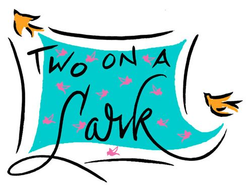
Numerous colored elements were added to both variations and the choices were circulated for feedback from discerning individuals representing a variety of age groups. A variation on the more playful version was developed further, with a casual script version of Lark plugged in, and color was added digitally. The logo was designed to be used online, on hang tags, business cards, and shipping labels. Here it is! Please contact me to learn more about my logo design services.


Leave a reply to Kacie-Linn Engle Cancel reply