Welcome to WordPress! This is your first post. Edit or delete it to take the first step in your blogging journey.
-
-
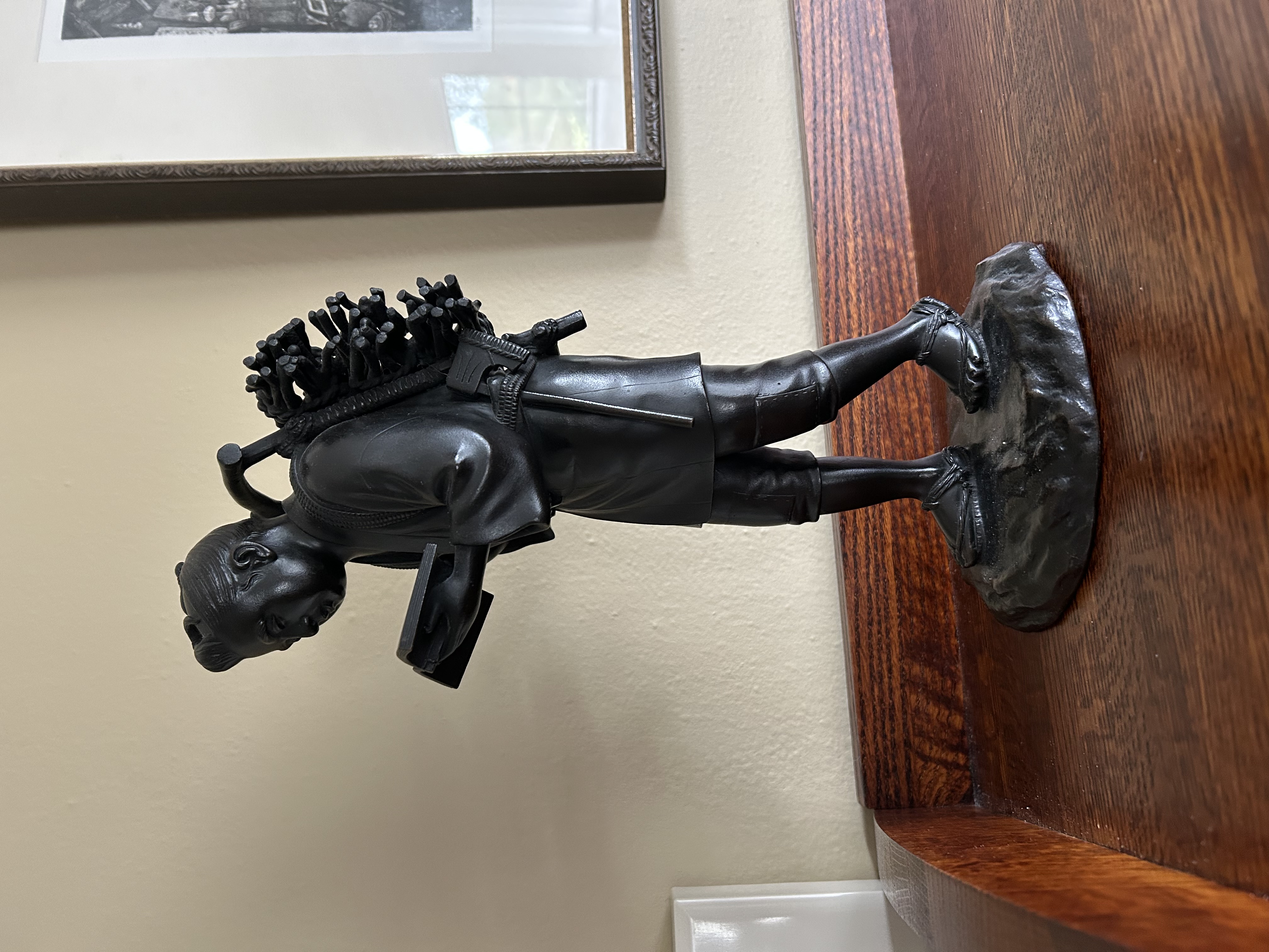
 As is sometimes the case, when the Drawing Group sits down to have our coffee together, the current host will set up a still life, or simply an object, for us all to draw. On April 1, our host placed a bronze Japanese figure of a man on her table, and that figure immediately grabbed our attention. The small sculpture was of "Kinjiro":
Ninomiya Kinjiro (1787–1856), also known as Ninomiya Sontoku, was a Japanese agricultural reformer, philosopher, and economist from the Odawara area who played a pivotal role in revitalizing rural communities during the Edo period. Born into a poor farming family, he rose to prominence through his industriousness, innovative ideas, and commitment to the principles of hard work, frugality, and mutual assistance.
(from odawara-guide.com)/ninomiya-kinjiro/)
After a drawing session lasting about 40 minutes, we compared our sketches which were done from three different viewpoints around the table. It's always interesting to compare what we have seen from our own chairs!
 View A: Drawn with a harder pencil, the light lines are harder to see but they do allow for easier erasing; this is especially helpful when drawing the human figure.
 View B: A softer pencil lays down more graphite, creating a bolder sketch. From this drawer's position, the face was in full shadow so the dark bronze patina concealed the facial features.
 View C: This sketch, done with a fiber tip pen followed by quick water washes from a brush, allows us to see Kinjiro's bundle of twigs and wood for making a fire in a stove to keep students warm in the classroom.
 -
When my daughter sent me a remarkable photo she took while traveling by train through the density of Manhattan, I felt inspired to crop the photo and offer it to the drawing group to interpret with pen and ink. Did they hesitate? No! Sometimes, a big challenge is welcome…and they met the challenge where I simply abbreviated the complex scene and only had spent one short session with the prompt image. My drawing partners took the studious and dedicated route and it shows:
 The overview: a cropped version of the original photo shown above on the left inspired my two drawing buddies to capture the dramatic geometry and window grids of the distant buildings while selectively rendering varied graffiti in the foreground. Below, after the crisp black and white pen and ink drawing was completed and copied, two successfully colored versions could be created.
 From the deliniated clouds to the individual bricks at the very bottom of this drawing, one can enjoy the shapes that make up a very complex cityscape.
 Softer skyline color in this version created an effective contrast between the soaring Manhattan buildings and the mega-sized graffiti lower down.
 My very quick sketch: I blame my slacker approach to my own "assignment" on the fact that I had more than one other major art project that eclipsed my time at this point in my life. I do kind of like the movement of the sketch down the page, though.
 Skillful use of color and shading in this drawing enhance the depth and angles of the buildings. A paler palette used on the skyscrapers draws the eye skyward while the more saturated colors pull us into the bold, graffiti facades of the foreground.
Credits: Thank you, Emily Asher, for the photo! And to my two partners in our now-15 year history of meeting on Tuesday mornings, year 'round, congratulations on your absolutely beautiful work on The Manhattan Project, Pacific NW Style. I think you should consider sending your artwork to The New Yorker. I'll keep my own tucked away in my sketchbook.
-
Over our nearly 15 years together, our threesome drawing group has met up at Seattle's Swanson Nursery Café numerous times when it has been "outing week" for us. With the lushly planted rockeries and soaring atrium plants above the koi ponds and merchandise fixtures here and there, a lot of sketching subjects are available while we sip coffee and share what's happening in our lives. Here are the sketches resulting from our recent visit:
 The back of a pottery display rack made a good subject for ink, ink washes and one added watercolor accent, all loosely applied.
 Painting a waterfall descending over basalt is a challenge. With simplified foliage, aqua water and minimal inklines, this sketch succeeds.
 My sketch shows a neighboring table that soon filled with brunch customers. The lofty atrium and gentle sound of water always provide a soothing atmosphere. I later wrote a note in the white space above the table and mailed it off.
 -
(A note from me, Jocelyn: I am currently redesigning my site. My name will be added to my banner soon!)
Could it be that my last post was done in December of 2021? Almost 2.5 years ago? But I have not been idle! One project I recently completed was a painting done for my husband as a Christmas gift.
For several years he has made me a custom, layered latté and served it to me in my location of choice around the house depending on what I'm engaged in doing. These are served in double-walled borosilicate mugs and arranged on a plate from his extensive collection of lovingly curated porcelain, stoneware or glass plates. A special spoon and an almond biscotti are carefully placed (parallel to one another) alongside the mug. A while back I thought about painting a collection of the plates alone on a canvas because they are so decorative. Shortly before Christmas in 2023 I decided I wanted to include a latté in a composition with the plates. The painting was done in acrylic because I wanted it to dry quickly and have a flat, contemporary character.


On the left is my first composition idea. But when I added color to the very small pen and ink drawing, the mug looked silly to me because the color seemed to make it look like it was floating above the plane depicting the plates.On the right is my revised repositioning of the elements. The plates I chose to use represent only a few of the now-extensive collection. Some day I will count them! Within the collection are several sets of three identical plates. These are used for my beloved little Drawing Group whose projects are shown primarily in my posts in Curry Powder, my everyday life topics blog.
Below is the completed painting (February, 2024). It was a good challenge for me to work with a random kind of composition. Shifting the elements required modifications, and a lot of color mixing was needed to match the actual plates. The painting now hangs in the barista's custom-designed prep area downstairs.
 12" x 24", acrylic paint on canvas
 -
Is there anyone who does not love acorns? Our drawing group threesome here in the greater Seattle area certainly does. This time, we designed these: Thanksgiving placecards, a label to enhance a bagged gourmet treat, and an autumn greeting card. Being inspired by the cute shape of acorns and the relative ease of drawing them, we had no problem coming up with ideas for applying our illustrations. Take a look:
 Exhibit A: A classic place card using tea-dyed paper features an elegant script and border acorns done with walnut ink. The leaf and acorn clusters are accented with watercolor. (Click to enlarge)
 Exhibit B: Here are my rare black acorns from Ashland, OR where I collected a surprising variety of others, too. I wanted to have fun creating repeat patterns with my detailed study.
 Exhibit C: A delicate line drawing of acorns and a casual pointed pen script create a lively composition for a label attached to gift bags of toffee.
 -
Readers might assume that the little Drawing Group of 3 is no more, but it is this reporter who is to blame for not representing our work for these many months! Through Covid, and through crazy Pacific NW winter weather, we have persevered and met whenever the 3 of us were all available. Here is proof that our pens and pencils are still at work (and our friendship is stronger than ever):

We settled in at a throw-back style café in the Greenwood district of Seattle, ordered our lattés and mocha, and shared the news of our week with each other. Then, I plucked this lantern from the back of our booth and proposed that we all draw it. We dove in, sipping our confidence-building beverages before putting pen and pencil to paper. Above, a trompe-l'oeil journal entry was added to the pencil drawing done on-site.

Because we were drawing the lantern from 3 seats around a square table, our perspectives were different. It's always fun to compare the challenges we encounter as we begin to record what we are viewing. Above, this drawing started as a pencil sketch and was later inked in.

My lantern is the bottom one, all sketchy because often (not always) I like to start right in with ink. We have talked about adding color to our lanterns but for now they shall stand as they are, mementos of two hours spent sipping, sharing, and studying an old relic.
-
 When I was a child living in suburban Seattle, in a house with a partial view of Puget Sound and Mt. Rainier, a house built by my father in 1951, I loved my dolls. This love continued after we moved abroad in 1961 after I turned 11, intending to stay a year or two at most.
 Recently, I dug out a bag in which I had stored a baby doll, complete with her wardrobe of hand knit sweaters and a tartan kilt skirt all made by my mom. I remember buying this doll in 1962 at a military PX in Germany. We were to spend much of the summer traveling by car, my sister and I installed in the back seat of our unreliable green Rambler. I was twelve, and still wanted a doll to keep me company during those prolonged explorations of foreign countries. All the dolls (except my Revlon doll) from my childhood had been left in Seattle, stored in the attic. I never saw my Seattle dolls again because we never returned to my childhood home. Our enriching life abroad suited us so we stayed.
One of those left-behind dolls was named Amosandra. I don't recall how Amosandra came to me because I can't recall not having her in my life. I was six when I learned to read and realized that her name was boldly embossed across her upper back, between her shoulders. The other unique thing about Amosandra was that she was a black baby doll. Who would have given her to me, I now wonder, a little blond white kid living in my completely WASP neighborhood? I don't remember not having her to play with. Amosandra was my ever-present baby doll and it seemed perfectly normal to me that she was dark-skinned as well as adorable. It wasn't until I opened the bag containing my 1962 baby doll with the sweaters that I started thinking about Amosandra. There in the bag were her red calico bloomers, the elastic still stretchy and the lace edging still white and nearly-new looking. The little dress with puffed sleeves that went with the bloomers, still so distinct in my memory at the moment I recognized the calico, was not in the bag. With my interest piqued about Amosandra's production history, and with a world of information now at our fingertips, I Googled Amosandra.
Beginning in the 1920's, the popular radio show Amos and Andy eventually spawned a TV show of the same name. Amosandra was the name given to a baby born to characters in a 1949 radio show. She was soon manufactured by the Sun Rubber Co. of Barberton, Ohio. For readers who are interested in this historic black baby doll and a broader history of black dolls, please go to this informative blog site authored by Debbie Behan Garrett: https://blackdollcollecting.blogspot.com/2010/02/moments-in-black-doll-history-amosandra.html
 The earliest Amosandra dolls by Sun Rubber were made in the late 1940s.
 -
In the spring of 2020, during which time I was sewing Covid 19 surgical masks for King County health care workers, I began work on a second book. Originally conceived as a booklet of biographical profiles, it evolved into a linen-bound hardcover book produced as an edition of 150 copies. Also a collaborative work, with my clients providing the colorfully written text, this book was fully illustrated by me with thoughtful, creative guidance from my clients. Calligraphic titles also added interest to the many profiles and historical additions.
The completed manuscript was sent to the publisher and binder in April of this year. Followers of my map artwork may be familiar with the large property map I did for this family in 2018: see my post on this HERE. In addition to images clipped from this map, I created many more for the book.
 Custom border design for one of the profile pages.
 This spread combines photos, image clips from the map, and one custom ink and watercolor illustration based on an old engraving.
One of my favorite spreads allowed me to draw a fun map showing aspects of the families' historical immigration routes and further travels in the Colonies.
-
 Colored pencil.
According to "Siri:" Gaillardia is a genus of flowering plants in the sunflower family, Asteraceae, native to North and South America. It was named after Maître Gaillard de Charentonneau, an 18th-century French magistrate who was an enthusiastic botanist. The common name [blanket flower] may refer to the resemblance of the inflorescence to the brightly patterned blankets made by Native Americans, or to the ability of wild taxa to blanket the ground with colonies. Many cultivars have been bred for ornamental use.
Happy to have the late-summer gaillardia flowers to brighten our table, we drawing group members didn't hesitate to enjoy drawing these glowing members of the sunflower family. Using the media of our choice, we then added color. I thought you, the readers might enjoy our renderings of this flower named after a French botanist.
 Watercolor with ink, image cropped, on hotel stationery..
 Watercolor with ink.


