Jocelyn Curry

Art & Joie de Vivre

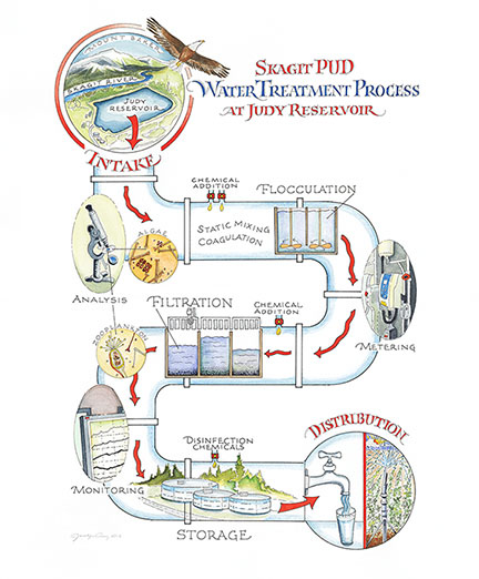
  • I was in an adventuresome mood when I accepted a large project in September, 2013. But was I up to the task of "mapping" the process of treating water at the Judy Reservoir Water Treatment Plant in Skagit county? New territory for me, for sure. The project began with an email from Kevin Tate, community relations manager for Skagit Public Utilities District. After seeing in a publication one of my maps for a nature trail on Guemes Island, he could foresee my work being applied to his visionary public relations concept. The treatment facility at Judy Reservoir (east of Mount Vernon and up above the Skagit River) attracts a lot of visitors. However, the visual aids in the Control House there have been minimal and not helpful in teaching public school groups and interested community members about the process of purifying stream water and river water into drinkable water.
    Process Map Blog

    Technical pen and watercolor were used for all four illustrations created for this project. The artwork was scanned at a high resolution (800dpi) which allows the art to be greatly enlarged for the display panels.

    Here's the nutshell version of my own creative process for the primary illustration. I did a total of four illustrations, three of which included map elements. The fourth will appear only in the interpretive display sign by the shore of Judy Reservoir and will not be part of the educational display area within the plant.

    Pipes blog

    During my site visit I took plenty of photos of pipes, meters, tanks, and chemical injectors such as those seen in this photo. 

    For any map to be helpful, there's a lot of sorting of key information that could be included. In the case of this project, visualizing how all of this information should be sequenced and illustrated was difficult for me. In the pencil sketch below, you can see the first generation of the map. This was not, however, my first concept; the first one was scrapped after it became clear to me that it was not going to serve the interpretive display AND the need for a take-away illustration for visitors. So I essentially had started over.
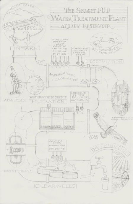
     

    Water TreatProcSketch

    A detailed pencil version of any map is essential for the editing process. Kevin Tate gave me specific feedback on this piece so that I was able to make corrections and additions before any ink or color work was done.

    My illustrations will be featured in the Control House of the water treatment facility (and one on the panel by the reservoir) and will be on view after a design firm completes the comprehensive display fabrication. This display will enhance the tours that are regularly offered at the Judy Reservoir facility. I will post information about these when the display is completed in the spring, 2014.

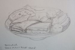
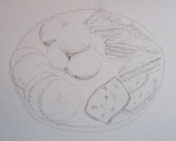
  • I can tell when I've come through a busy period. How? By gasping when I see how long it's been since I posted things on this site and on my professional site. It's true: "the holidays" keep most of us pretty well tied up with seasonal activities, projects and traditions. After the rush & hubbub were over, the little drawing group convened and exchanged stories about our hubbubial lives. What did we sketch? A plate of Christmas cookies, of course! Here's what showed up in our sketchbooks:

    DSCF1348

    I deconstructed the plate of cookies.

    DSCF1345

    Because we are all different heights, we invariably draw our subjects from different perspectives. We talk about this a lot, explaining to one another the aspects of the drawing that were challenging or surprising. By drawing different kinds of things, we learn a lot about how to clearly see them well enough to draw them with some accuracy.

    DSCF1347

  • Color testIt is the Yuletide season, and my preference would be to be applying myself to making gifts and cards and maybe even fruitcake. But the fact is: I have a big project I'm pushing to complete. Yesterday it occurred to me that I haven't posted anything here since I painted my pomegranate over a month ago. So what can I post for viewers that is some indication that I've been working in my studio? Not the actual artwork, but something I might have fonder feelings for: the sheet of paper on which I unload some paint from my watercolor brush, or test a color before lighting into the artwork itself. I call it a witness sheet. I've always loved these witnesses to the work, whether they be pen marks for calligraphy pieces or brushmarks for illustrations. This job is an illustration job with a little bit of lettering incorporated.

    If you look at this and think, "That must be a rather large project to have so many colors and dabs," you would be correct. I started it in August with a site visit to a water treatment plant. Definitely not my area of expertise so the subject matter has provided me with an educational opportunity, shall we say. Hence all the blue dabs on the witness sheet on my drawing board (water). The final artwork will be published here after it is installed. 

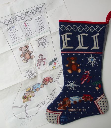
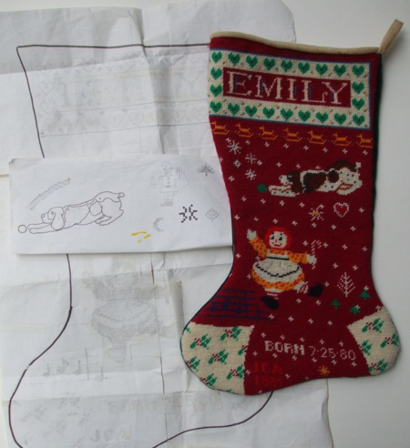
  • When I started designing a needlepoint stocking for my first child, I had never done needlepoint. Lots of sewing, knitting and embroidery yes, but no needlepoint. The year was 1978 and my preference for making as many things as possible by hand was well in place. I learned what a unique design challenge it is to create a design based on a grid and to shade and color pictures with yarn. I love it still, even though my time for such work is limited.

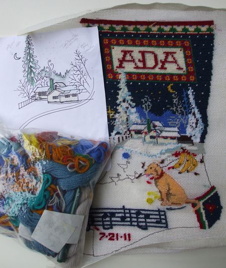
    Below I have posted a series of photos of the two stockings I eventually completed for son Eli and daughter Emily. The third is for Eli's daughter Ada, and it is a work in progress as you will see. On Christmas Eve it will be filled by Santa if all the stars and yarns are aligned.

    Is there anything sweeter than to stitch something for a beloved child? To keep the little one in mind, stitch by stitch, throughout the creation of the object, trusting that this thing will be used for many years and that a bit of the maker's heart and soul remains entwined with the stitches even after she, the stitcher, is gone? No wonder the tradition is worldwide and ongoing, especially for the mothers and grandmothers and great-grandmothers whose fingers speak a unique language of love.

    DSCF1268

    DSCF1269

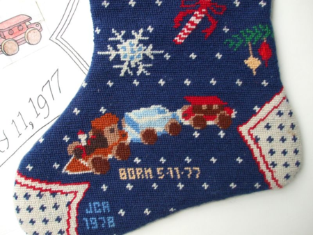
    Eli's stocking featured a couple of favorite toys, and a few Christmas motifs. In real life the train was simply wooden. I colored it to add more interest.

    DSCF1271

    DSCF1272

    Emily's stocking depicts the Raggedy Ann my mother made for Emily, a favorite dog belonging to a friend, a snippet of "Jingle Bells," her favorite song at the time, and a scattering of motifs I designed.

    DSCF1273

    DSCF1274

    As you can see, my confidence has grown over the past 30 years and on Ada's stocking I depict her beautifully situated home in a nocturnal, snowy setting. In the foreground are some of her favorite things: the family dog Stella, bananas, and a snippet of the lullaby her "Papa" Rick wrote for her. A couple of other little illustrations will be added, time willing.


    DSCF1332

    Ada's finished stocking includes one chicken and one duck instead of the original drawing of three ducks. Next Christmas her stocking will hang from the farmhouse mantel!


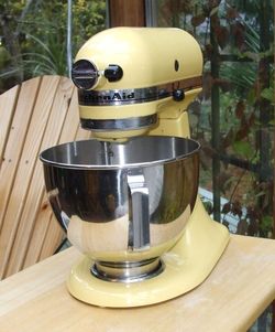
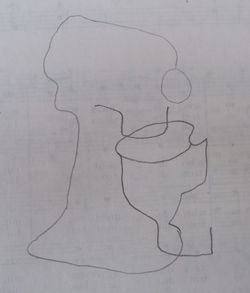
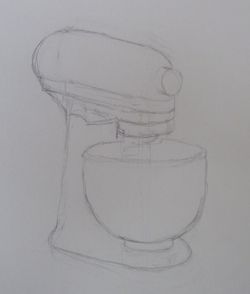
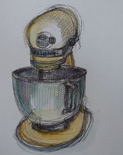
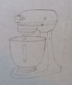
  • "Can we work on foreshortening?" asked one of my drawing group members on Tuesday. "Yes!" was my reply. So I went off to find something we could all draw as a foreshortened object. A quick surveying of my kitchen yielded a subject: my yellow KitchenAid mixer. Here are the results of our drawing practice:

    DSCF1157

    Our subject.
    DSCF1163

    A blind contour drawing sometimes shows remarkable accuracy even though the drawer is not concerned about perfection while making the drawing. The angles and proportions here are quite close to being correct.
    DSCF1162

    After the contour drawing, this sketch was carefully made by observing the relationships between each basic shape that made up the mixer.
    DSCF1160

    My view of the mixer was close to head on. I made this sketch as a demo while the other two watched. Obviously, I made many on-the-spot corrections without erasing. One drawer commented: "That's OK. It looks like it's moving." I'll take it!
    DSCF1158

    Careful observation and an eraser were needed to create this clean, well proportioned sketch. We all agreed that this innocent-enough project challenged each of us.
  • Once in a while, I take time to do a small oil painting. And once in a great while, I find a pomegranate in a bin of them where the pomegranate has a full crown. This one was a beauty, so I decided to paint its portrait:


    DSCF1148

    Oil on "Gessobord" 8"x8"


  • Years ago I did several jobs for a client whose life story unfolded by way of a series of calligraphic pieces he commissioned me to do. First: a written song with which to woo a love interest. Then, a poem to honor their marriage. Then, a poem commemorating their firstborn child, his daughter. Some years later, a poem to help him through the pain of their divorce. A few years later, I gave the daughter a private calligraphy lesson at my dining room table. Following this came another poem to woo another love interest! The most recent assignment from him: a row of musical notes that would be tattooed on his arm. This last project was in 2008, I believe. You can see how the work of calligraphers can take on significance in the lives of our clients.

    Fast forward: I have another tattoo design assignment, but not from my longtime client. A woman who has been working her way through numerous life (and death) challenges within her extended family is once again calling upon my skills as a calligrapher to bring power to the word. Her chosen word will be tattooed on her wrist so that at any moment from now to the time she is in her last moments of life on earth, she can look at the word and draw strength and solace from it. And, when she can no longer speak, she plans to raise her wrist in farewell to those who may be present! Below are the choices I wrote out for her last week. They haven't been polished yet; she will select one, and I will do some retouching of the calligraphy to suit the tattoo artist's requirements:


    Onward Brush B

    This is the version my client is leaning toward.


    Onward Gothic
    As a nod to the Gothic tradition in tattoo art, I offered this.

    Onward Italic

    At first look, this is the version that was preferred by my client. She liked the bird, and as she is not a "swirly" person (the O in the first version), this one spoke to her. But, after further review and after collecting opinions from her family, she will probably go with the top version.


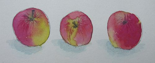
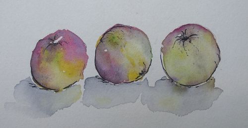
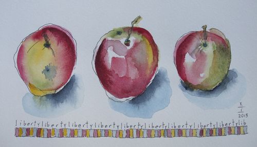
  • On this October day, we had no set subject to draw. But there was a plate of small, homegrown apples (intended for eating), variety "Liberty" that served to provide subjects for drawing and painting. How convenient:

    DSCF1038
    DSCF1040
    DSCF1041
    Three artists, three renditions! We all tried to loosen up our brushes so that the watercolor would flow and blend the way the colors on the skin of the apples did. We added some light pen work to bring in some definition. 

  • Rutherglen tile wc

    We received mixed info: one person said that the tile was from Italy, and another source said it was French.

    Staying in historic B&B's always has appeal. Exploring a building that has served as a residence for significant citizens of a place can be intriguing, and revealing. Last month we stayed in one such B&B in Longview, WA, the home town of my husband. Tired but elegant in "bones," Rutherglen Mansion is a noble old home in need of restoration and a more professional staff, but it nonetheless has some beautiful features worth admiring. An example: the European tile in the bathroom of our room was elaborate and in excellent condition. Floor to ceiling and bold in color and pattern, the tiles still shone with earthy richness. I felt compelled to sketch a portion of the wall tiles to show the variety in the tiers. The pen, ink and watercolor tile sketch is above.

    Of interest to artists would also be the former library of the home which is paneled in local Douglas fir adorned with "grainart" images. This room is currently part of the dining area jon the main floor. It was too dark to photograph. 

    Below is an arial view of the Rutherglen estate. The home was completed in 1927 for J.D. Tennant, the superintendant of Long-Bell Lumber. It was subsequently used as a home for troubled girls, and also as a nursing home. The estate overlooks the Columbia River and the mills alongside it.

    Rutherglen arial

    The property overlooks the Columbia River and the lumber mills that were the foundation of the city. 


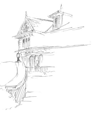
    Rutherglen sketch

    A terrace overlooks the estate. Pen and Ink.

    I always remind drawing students that drawing houses and other buildings provides one of the biggest challenges in the realm of freehand sketching. Capturing accurately the persepective, the scale, and the right amount of detail add up to a tough exercise. Here, I began a sketch of the back of the mansion, the side that overlooks the river. My progress was happily interrupted by my granddaughter who arrived to join us for the Sunday brunch.

    Do I recommend staying at Rutherglen? Only with cautionary recommendations: it is not your usual, comely B&B. 


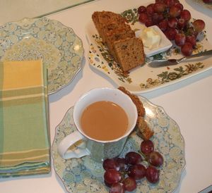
  • Sometimes, life interrupts and we must set aside things we ordinarily love to do. Such was the case in late June when a member of my little drawing group had to tend to a family health emergency. Today, the three of us reunited after 2.5 months. Those missed months apart seemed to evaporate as we shared in delicious coffee, seasonally-appropriate zucchini bread, and all the news. Our drawing activity was officially planned: we would doodle as we did our best to catch up on our summer experiences, good and not-so-good. Did we all feel lighter upon bidding one another goodbye after our two-hour time together? I think so. Here are our doodles:

    DSCF0841Oh, but before I post the doodle collection, let me share the sight for sore eyes that greeted us when we convened. And I had not yet had coffee nor breakfast yet today, so this beautiful little spread was especially mouthwatering. Have I mentioned before what a fine combination it is, to sip, eat, and sketch together?? 


    DSCF0846

    An assortment of free association doodles


    DSCF0847

    One doodle becomes an illustration when enlarged.
    DSCF0843

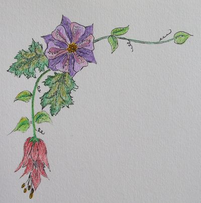
    From the imagination emerged this delicate corner motif.
    DSCF0844
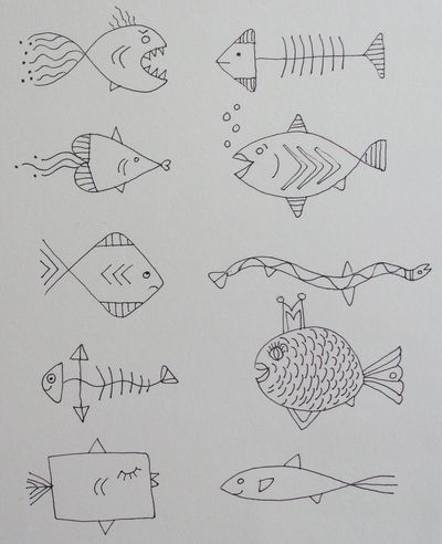
    I was in the mood to draw fish.