Jocelyn Curry

Art & Joie de Vivre

  • One never knows who will ultimately look at artwork that is sent out into cyberspace via websites. I know some artists who feel very protective of their work, keeping it by and large offline, out of reach of the prowler who might steal an image for use in a project. What are the chances that they would actually ask permission, that they would have the decency to do that before stealing it, altering it, taking advantage of it? I don't know the answer, but I do know that in the past twelve months, I've had at least three pieces of my artwork discovered on this web site that viewers have found and actually written to me regarding my copyright. They wanted to use the work. For one, an eyedropper illustration of a buffalo, I was paid promptly for its use on a hand painted teepee up in Manitoba, Canada. The second one, a horse image, was in the end not used but it was in the running for use in a logo. The third illustration, featured here, was used in trade for one of the products on which it was to be used plus a credit line. 

    If you click on this link you will see my previous post the graphic designer landed upon in order to find the line illustration featured on the kraft board cassette tape box below. He, Matthew Miller, had already worked the drawing into his design when he wrote to me. Of course it was fine with me for him to use it. It was immediately obvious to me that Matthew is a fine designer. And after all, I had done it 21 years ago for a personal family Christmas card and it was one of 3 layers of artwork! See how handsomely this Marmara Records packaging turned out. Nice job, Matthew! I'm pleased that my line drawing has found another raison d'être:

    DSCF2038

    An intriguing package for "Family Ark" included ephemera, and a cassette of the music of John Coyle.
  • DSCN1389

    The scenic Diablo Lake peninsula trail (part of the Environmental Learning Center campus) is lined with magical wildflowers at this time of year. Here is a spread of dainty twinflowers thriving in the shade.


    DSCF1967

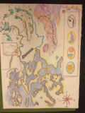
    Billowing clouds and meandering waterways characterize class assistant Sarah's map.

    Part II

    Conventional maps can do no more than point the way to unpredictable, individual experience, while artworks embody those experiences. Katharine Harmon

    Here you will see more expressive, personal maps from The Artful Map, A One-page Nature Journal held at the North Cascades Institute's Environmental Learning Center June 20-22, 2014. Not all maps could be included, for which I apologize. Please excuse the gaps, as I try to make the blogging software do things it doesn't like to do!

    To see larger versions of these photos, please click on each image.


    DSCF1928

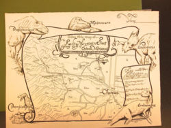
    Geological layers and dinosaurs are featured in Dave Braun's map.


    DSCF1959

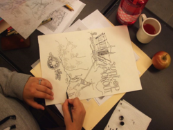
    He used letter forms derived from historic maps to further ornament and embellish a map that looks fictional but is indeed factual. Dave left his map uncolored so that it could be reproduced in black and white and offered as a page to be colored by visiting youth.


    DSCF1957

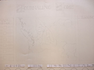
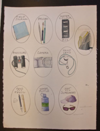
    Designing for a full sheet of watercolor paper, Lyn Baldwin pencilled a large territorial map surrounded by titling, color codes, and significant tools used by natural journalists. In the photo below on the left, Lyn has created vignettes containing the ten essential gear items for a field journalist.

    DSCF1960

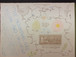
    Mt. Rainier's Wonderland Trail is the subject of Jessi Loerch's memoir map. She filled her sheet of paper with meaningful drawings and quotes.

    DSCF1956

  • DSCF1964

    Craig Campbell designed a map pertaining to the North Cascades experiences and philosophies of notable poets. 

    I sense that humans have an urge to mapand that this mapping instinct, like our opposable thumbs, is part of what makes us human.  Katharine Harmon, author of books on maps.

    Thirteen map designers appeared at the North Cascades Institute Environmental Learning Center on Friday morning equipped with the urge to map, and some art supplies. They left Sunday afternoon with illustrated maps that were fascinating and varied. These maps represent extensive work done during 15 hours of class time (plus, for many, some nocturnal time or pre-class early morning time). In the photos below I will show some work-ups and partially done maps as well as the completed, or nearly completed, final maps. Not all maps were fully documented by my camera; I've selected several of them to feature here.

    Designing and making a map is a complex project. This group remained impressively focused with novice artists working alongside the more experienced. All the careful design and execution work paid off, as you will see in the photos. Perhaps, like Katharine Harmon (above) says, it's in our deepest nature to want to draw maps. It's just that so few of us ever actually make them. This workshop provided that opportunity. 

    To view larger images, please click on them.

    To read a review of this course (and more information about programs at the Learning Center) by participant Jessi Loerch of the Everett Herald, please click here.

    DSCF1930

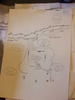
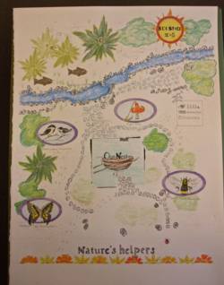
    Beginning structure of a seasonal garden map by Joan Poor.
    DSCF1958

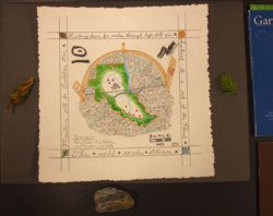
    Inkwork done with a vintage dip pen nib, India ink, and colored pencil.


    DSCF1923

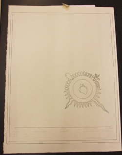
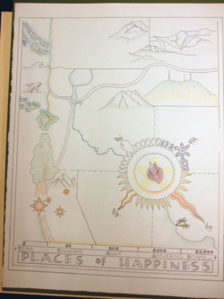
    Richelle Potter drafted a precise map of "Places of Happiness" from throughout her life. Subtle coloring in watercolor pencil is not yet complete in the photo to the right.

    DSCF1970


    DSCF1924


    DSCF1968

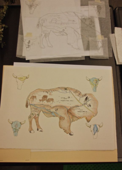
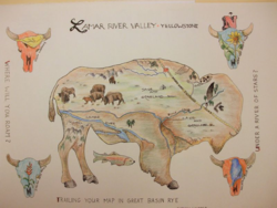
    Carolyn Hopper's bison-themed map was inspired by her visits to Yellowstone's Lamar River Valley. Her clean design allows the eye to move around to discover all the fine detail.


     …we continue to make maps. Why? Because making maps is a way of understanding. We make maps to sort out the physical world, to see its size, shape, color and texture. We make personal maps to share our experiences and travels, relationships and ideas. Jill Berry, author of Map Art Lab.

    DSCF1927

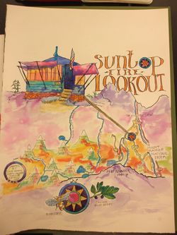
    For her brilliantly colored map, Cole Adams commemorated her summer stays with her son in a fire lookout. She used a vintage dip pen with India ink and watercolor.
    DSCF1961


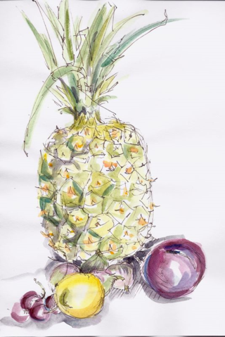
  • A brief stop in the produce department these days yields such succulent fruits! Today our drawing group met and spent an hour sketching a collection I put on the table. My two chums are still working on theirs, but mine is ready for viewing, sketchy though it may be:

    Summer Fruit

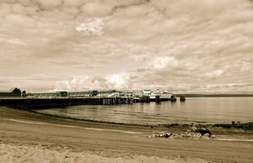
  • If there ever were a perfect day to meet at a beach, sit on a log, sketch, visit, and eat, it was last Tuesday, May 27. Other than the mock-drowning we witnessed (the underwater park for scuba diving is located in the waters there), and the little 3-year old who sat down with us to draw, there were no distractions. Just enough sun, just enough clouds, just the right temperature. Did we think of anything but what we were seeing, experiencing? I don't think so. I'll have to ask my drawing buddies if our time there was timeless for them, too. Here's my page of sketches. Beneath that, an adjusted (at home) photo I took. Highly recommended to all of you artists: get outside to sketch this summer!

    Ferry sketch

    Pitt Artist's Pen "S" and watercolor on cold press watercolor paper, 6"x9". This is a journaling format I like and encourage students to try, which is to have one large sketch and one or more small sketches done in the same sitting, of detailed subjects. One then records multiple aspects of an experience or a place.

    DSCN1367


  • OverheadViewMapsmall

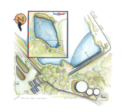
    Overhead view of the Skagit PUD Water Treatment Plant at Judy Reservoir. I completed this artwork in January, 2014, as a part of an extensive illustration/mapping job for the Skagit PUD. Maps intrigue us with their symbolic nature, their color schemes, and their helpfulness in our wayfinding. This map was done with pen, ink and watercolor. Most labels for the map above are being added digitally rather than being handlettered.

    Preparing to teach my Artful Map class which will be held for the fourth year from June 20-22 up at the North Cascades Institute Environmental Learning Center is a pleasure for many reasons. One: because I never fail to be awed by what the participants create in what is essentially a 48 hour period, I look forward to meeting them. Two: I always take note of what worked well the previous year and enhance that for the current year's curriculum. Fresh techniques are added, and others discarded. Three: for me personally, being up at the Learning Center is always an exceptional experience in and of itself. I never tire of singing its praises. 

    This class is now full. To review the work done in previous Artful Map classes, please click here. This will take you to a long, scrollable column that includes my own map assignment work and workshop reviews with many photos of students' work. 

    I will be posting a review of this map workshop within two weeks. Thank you for your interest!

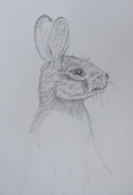
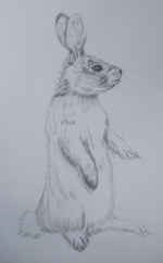
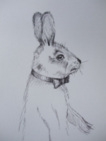
  • Time for a report from the little drawing group! We met chez moi in early April, and were inspired to draw something with some Easter relevance. Over the course of the years, we have sketched many different things, but never, in any detail, a mammal. Oh–on second thought–we did sketch one of our member's black cats. But the cat wasn't particularly Eastery so I'll feature our rabbits (Desert Cottontails). Mind you, we couldn't find a Desert Cottontail who would sit still for us so I resorted to borrowing Irene Brady's example in The Redrock Canyon Explorer. (Thank you, Irene!)

    Here are our sketches:

    DSCF1701    DSCF1702     DSCF1700

  • ~~~~~~~~~~~~~~~~~~~~~~~~~~~~~~~~~~~~~~~~~~~~~~~~~~~~~~~~~~~~~

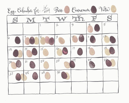
    In April, after a winter of no egg-laying happening in my girls' coop, the eggs started to appear. Being four years old this spring, the hens were supposed to be pretty much done with laying, or so all the despairing jumped-on-the-backyard-chicken-trend writers were saying. Not so with my three. To keep track of their production, I decided to have a little fun and design a way to visually monitor this unexpected abundance! Here you go:

    April egg calendar

    Calendar form was drawn in pencil, and then inked in with a pointed pen. A very casual pen script was added along with freely written versal letters for the days of the week. I cut a little egg eraser stamp and used three colors of brown stamp pads for distinguishing who laid eggs on which day.
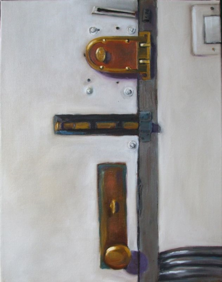
  • When I first went to Brooklyn, NY to help my daughter paint and enhance her apartment last September, we started with the entrance hallway. When it was time to paint the door, I volunteered to do the detail painting around the hardware on the door. When that was done, I was struck by the graphic impact of the locks and the history of securing residents they represented. Inspired by these two elements, I immediately felt moved to paint that section of the door in oil on canvas. Here it is:

    DSCF1577

    6th & Flatbush, oil on canvas, 16"x 20"


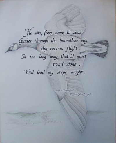
  • My wedding was in 1975. What does this have to do with my first calligraphy commission? As a then-employee of the University Bookstore in Seattle, I fell into possession of an unneeded Speedball lettering booklet in Spanish. I copied the Italic style of calligraphy in that booklet and soon deemed myself qualified to do the calligraphy on my wedding invitation (a little knowledge is a dangerous thing). So, armed with my newfound expertise, I accepted a calligraphy and illustration job from a friend who had admired the invitation.

    Last week that artwork was returned to me because the friend is gravely ill and wanted me to have the piece. It had been a gift for his mother in 1975. When she died, he collected it from her home and has kept it with other keepsakes. I photographed it so that I could share it here but didn't feel I needed to keep it. It has a new home now, and that is with the older brother of our ill friend. The poem and the goose were meaningful to the sons' mother so it is ideal that it is staying in the family.

    DSCF1542

    Canada goose with Bryant poem: ink, graphite and colored pencil on illustration board 12"x16"