Jocelyn Curry

Art & Joie de Vivre

  • To Summarize: Drawing Group consists of three of us. I guess it should be Drawing Trio. But that's beside the point. We alternate homes for our morning visit/eat/draw sessions and for the fourth session we have a little field trip. In February we went to the Café Louvre (previously Tully's, and still a friendly, roomy café with excellent baked goods) in Edmonds. We scored a spacious table with a good view of the clinetèle and then started what is a tricky exercise: sketching people quickly–because people move.

    Here are a few of the sketches that we deemed fit to print:


    DSCF2597

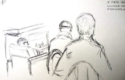
    Notes: excellent perspective for a quick sketch. There is little or no time to erase and correct when sketching quickly so the accurate capture of distance is impressive in this sketch. Another effective aspect here is that the most distant man is sketched more lightly, telling us that he is farther away. Yet, he is the focal point for me because we see his face and his situation by the fire.
    Louvre sketch 3

    Notes: the most distant man in the sketch above is the same as I captured here.


    DSCF2598

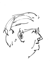
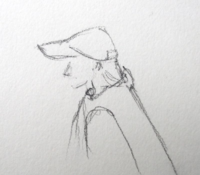
    Notes: with a few pencil lines, the drawer indicates that this is a female. We noted that the café was hosting a lot of men enjoying camaraderie and reading by the fireplace.


    Louvre sketch 2

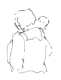
    Notes: one challenge in drawing in ink is that every mark is strong. Therefore, the baby's face needed to be indicated with as few marks as possible so that it remained babyish and sweet.


    Louvre sketch 4

    Notes: one super-quick sketch by me. I like the spareness of this one.


    Louvre sketch 1

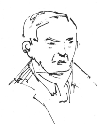
    Notes: the ink I used makes this man's face more severe than it would have appeared had I used pencil. I'm glad he didn't come to take a look; we try to be inconspicuous in our sketching activity!
  • The Artful Map, a One Page Nature Journal is a course held over three days at the North Cascades Institute Environmental Learning Center (NCI-LC). This year this will be June 26-28, 2015. The class is listed online and registration is open! Click here to go directly to the course description. You may also read the lodging options (these dictate the cost) on this page. 

    A note about the course title: over the years that I have taught this class, I have encouraged participants to bring their own ideas for maps they would like to make. These may not have anything to do with nature journals. To me it is more important to offer a customized learning experience than to hold students to my original concept of the class. We just haven't changed the name! Going to the NCI-LC is in fact going on a retreat where you will have lots of time to immerse yourself in your work. Maps are labor intensive. The late June days are long with sunlight, allowing time for hiking, eating, walking in or sitting in the forest or by the lake in addition to your working time in the classroom.

    I have posted extensively about this course. Please follow the link below to see these reviews and some of my maps done as professional assignments.

    http://www.jocelyncurry.com/jocelyn_curry_calligraphy/map-design-mapmaking-classes/


    OverheadViewMapsmall

    One of four maps made for Snohomish County PUD"s Judy Reservoir water treatment plant, this map shows how geometric shapes and map graphics are enhanced by classic ink drawing and watercolor use. The client didn't want any labeling on this map so it is in effect incomplete, Labeling was to be done later, using fonts.


    Registration for Letters of Joy, where the class below will take place, begins March 16–not before. Click on the link for Write on Calligraphers to print out the form to mail in for registration. 

    The Personal Letter as Manuscript, May 1 + 2, 2015, Letters of Joy regional conference for calligraphers and artists. Sponsored by Write On Calligraphers  (WOC) of Edmonds, WA. This conference is held at Edmonds Community College in Lynnwood, WA. Classes are held all day on May 2. Keynote address, vendors and a silent auction will be held in the evening of May 1. A registration form will be available on Write On Calligraphers' website (the link above will take you there). 

    The Personal Letter as Manuscript will be a two-hour class, as will all of the Letters of Joy classes. I will offer instruction and experimentation in using calligraphic fountain pens as sketching, writing, and decorating tools on personal notes and letters. An example of what I'm talking about appears below. Please check back and keep an eye on the WOC website.

    IMG_0950

    A fine-tipped Shaeffer calligraphy fountain pen, colored pencils and metallic gel pen were used to write a spontaneous letter. Common manuscript elements of a top border, an initial cap and a side and bottom borders were used. No lines were drawn ahead of time; the idea is for a letter to be spontaneous in appearance.

    Possible Art Map workshop in southwest Washington State/Portland, OR

    There is interest in my teaching a map workshop in the vicinity of Vancouver, WA or other location convenient to those in southwest WA and Portland and nearby communities. Are you interested? Please let me know! Email me via the link in the column to the right of this one. Thank you!! I'd love to see you in class.

  •  

    Crone with cane!

    "Thanks to modern medicine and your indomitable resilience, this scene is not your future!"

    Like any life experience that requires endurance whether physical or emotional, the memories of the experience fade as we adapt to whatever is our new lot. When I told a friend that I didn't want to forget what I have recently endured, she said, "But isn't that normal, to forget pain, as when women forget the pain of childbirth?"

    When I said that I didn't want to forget, what I meant was that I didn't want to ever again take for granted the ability to walk, to lift my grandchild, to carry a bag of groceries, and even to put on a pair of socks. When we cannot do what we have always been able to do, life changes radically. When a hip joint breaks down, this is what happens.

    In my case, a sometime-in-the-future surgical repair, if it came to that, would be available. I knew this. Mind you, I did everything I possibly could to avoid surgery. There was not a joint health supplement (and there are many) that I didn't try, nor an exercise I didn't do that was promised to help relieve the pain and disfunction of osteoarthritis of the hip. For two years I kept trying, reading, hoping for my body to not fail me. It never had before. Increasing doses of ibuprofen were the only thing that helped for a while.

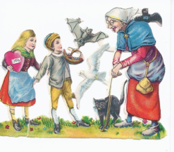
    Note the crooked woman in the piece of die-cut German ephemera above. I looked like this (minus the bat and the cat!) just a few weeks ago. An empathetic, relieved friend of mine created this little card for me after my surgery. Since the day two years ago when she noticed my limp and occasional stumbles as we walked around Greenlake together, she had worried about my hip and the future of our shared adventures. After all, since the age of 17 when we hitchhiked around Germany and later Eurailpassed all over Europe, we have taken our mobility for granted. We are both hearty, active souls.

    When the day came last July that I couldn't safely walk without support, it was this very friend who offered me a cane and a pair of crutches that had been stashed away, "for when we get old." Ack! Apparently that day had come for me! A few days later, I had an x-ray (my second) taken. There was an unequivocal evaluation: severe osteoarthritis with the possibility of avascular necrosis. OMG. This is the death of tissue as a result of lack of blood flow. There was one solution: a total hip replacement, period. So I relented. I let go. Three weeks later I met with a surgeon and saw my pitiful hip in the x-ray. Not surprisingly, it hurt even more after I saw how the ball of my femur was no longer spherical, but amorphous. The pelvic bone looked like a lunar surface because cysts were blooming all around the femur head. Just ugly. My poor hip. I was stunned. At that point, I couldn't wait for surgery. I was ready right then and there.

    But there was a problem. After the consultation with this surgeon, I unexpectedly felt that he was not the right one for me. This surgery, my first ever, was to be a big deal; after all, I was going to "lose my bones" and have a prosthesis forever inside my body. My gut reaction was that I needed a different, more experienced, more…je ne sais quoi surgeon. After awkwardly saying this much to him, I sat kind of stunned in that consultation room then slowly, painfully arose from my chair. I walked with effort to the lobby and sat down. I needed to research the other surgeons available to me, so I went home to do this. I selected two others in this orthopedic group and called for an appointment. After waiting another five long weeks (it was summertime, and these were evidently popular surgeons) I returned to the clinic and waited in that same room for the second surgeon. Well, within the first minute of this consultation, I knew he was the right doctor. Dr. W. Oh sweet relief.
    Hip post

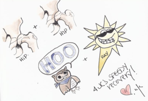
    Waiting for me at home after my surgery was a handmade book filled with funny, uplifting, and affirming illustrations and messages from my friend K. With so much support, how could I not be the happiest, fastest-healing woman ever? This is a good time to shout THANK YOU! to all those close to me who helped so very, very much.

    It was hard to wait another 8 weeks for surgery. I no longer felt safe walking across the street to get our mail. November 13 finally arrived. I opted for the anterior, or frontal, approach (less common than posterior). Dr. W offered both. From the time I first got out of the hospital bed my walking was better than it had been just the day before. In spite of the discomforts that go with surgery and hospitalization, I was euphoric. Dr. W was very happy with the x-ray taken immediately after surgery. Some weeks later, an acquaintance said, "I wouldn't have had the courage to have that surgery." Courage? It took no courage at all. I tell people that I had no rational choice. It was either eventually live in a wheel chair or have surgery. A no-brainer.

    My recovery was rapid. I was religious about doing my in-hospital and post-surgery exercises. I can't imagine being more motivated to recover. Two physical therapists were highly complimentary; one even called my condition at 6 days after surgery as "a miracle." See? I knew I picked the right surgeon! Plus, I really worked at doing all the right things to prepare myself. I read a lot, talked to people who had had this surgery, and I had fabulous support, good food, and prayers from family and friends. 

    At six weeks, I had my first check-up with my surgeon. So special to me was this meeting with Dr. W that I even wore a new dress. Overflowing with gratitude, I had written down what I wanted to say to him in case I became weepy. When I arrived at the clinic my new hip was x-rayed again. I was led to the office and waited for Dr. W. The door opened, and in he walked, beaming. He handed me a copy of my x-ray. My jaw dropped. I had a sculpture in my body! Indeed, I lost some bone, but in its place was a titanium and porcelain creation that has returned so, so much to me. Further, I was awed to have Dr. W tell me that my bones had already knitted to the surfaces of my sculpture within. We were bonded. I'll never see the kinetic artwork inside of me except for in the photo below, but not one day will go by in my life that I don't feel deep gratitude toward it and toward the man who installed it. Before surgery, I told people that struggling with my hip disease was like living a bad dream. And now, I have awakened from it!

    X-ray

    My new hip is a smooth operator, a thing of beauty. It makes going through airport security a new experience, and I can't take up running again, but that's OK. When I look now at Mt. Rainier I just smile. I know that I can hike her trails again and carry my granddaughter again and simply go for a walk again because I have this sculpture within.


  • January is the perfect month for allowing fresh ideas to come forth. Yesterday, while flying from Oakland, CA to Seattle, I was awed by the prominent peaks of the Cascade Range as they pierced the low cloud layer in all their frosted beauty. Ideas for teaching started coming into my mind like so many flashes off the wing of our aircraft. 

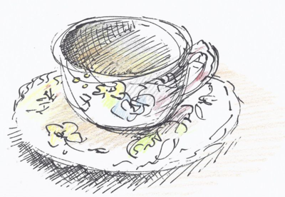
    Curiously, the good old Schaeffer calligraphy fountain pen flashed into my mind. I've done very little sketching with this pen, but it offers so much as a drawing tool. This morning I pulled it out of a drawer and it was ready to go to work for me. Here's what I drew:


    Cup

    Coffee cup at drawing group meeting. Schaeffer pen (fine tip) and colored pencil.

    The regional calligraphy conference, "Letters of Joy," will be held at Edmonds Community College in Lynnwood, WA on May 1 & 2, 2015. I'll be proposing two new 2-hour mini-classes, one of which will be a little workshop on using calligraphic fountain pens for sketching and letter writing. Why use a calligraphy fountain pen? Because the broad-edged nibs in these pens give us thicks and thins which create more textured sketches. In early days, hand-cut quills were used for drawing, yielding the original quality of varied line width.

    As confirmations take place, I will post more detailed information about all 2015 classes I'll be teaching. 

  • I winced when I logged on here to Curry Powder because it's been so long since I posted anything. I didn't really want to see the date of the last post, even. There are reasons for the long pause but all of those aside, there's one excellent reason to post the Drawing Group's recent celebration today: WE FINISHED OUR HOMEWORK!

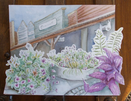
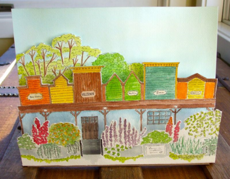
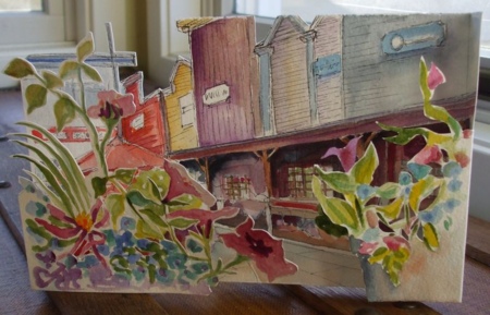
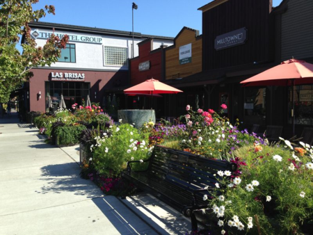
    One stunningly perfect morning in August we met up in Edmonds, WA to draw a favorite town haunt: the recently enhanced Old Milltown. The hardscaping and floral plantings took our breath away while the proper row of storefronts created a contrasting background to these. Hence, my suggestion was to create a two-layered drawing. We didn't discuss the intricacies of designing this way so it was only after we all got started that we realized that we had 3-D challenges ahead of us. We spent two hours sitting amidst the planters, grappling with perspective, color, pattern, you-name-it. After this, we took our work home with us and dealt with the next stages by ourselves. We did work on these in our weekly meetings once or twice, but needed to concentrate in solitude in our studios to really put them together.

    So, four months later, we had all completed our pieces. One of us completed hers within weeks of that summer experience. The other two of us managed to get ours done last week. That's why we are celebrating! Usually, we spend one two-hour gettogether on a project. Sometimes these projects turn into a more developed one. In this case, we had our "homework." Take a look. Following the photos of the artwork I have posted a photo of Old Mill Town:

    DSCF2489

    A harmonious and muted palette characterizes this "pop-up" version of Old Mill Town. Pen, ink and watercolor were used in all of our pieces. In this one, the plantings are clearly the focal area with the buildings offering a backdrop. (appx. 8"x10")
    DSCF2479

    This member opted to render the scene from a head-on perspective. She exceeded the assignment by adding a third layer behind the buildings: the trees. Behind these: the soft blue sky. We all selectively omitted certain details or created some from our own imaginations. In this composition, the added layers really enhanced the whole. (appx. 9"x11")
    DSCF2494

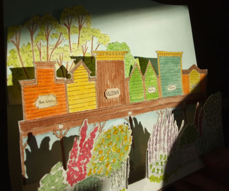
    As I was photographing our finished pieces, the December sun flooded the room. This member saw how the sun created dramatic shadows so I took a quick photo to show the dimensions.
    DSCF2483

    This is my take on Old Milltown. Compositionally I don't give it a high mark but I loved the entire experience of sitting in the sun, working from photos in my studio, occasionally pulling the pieces out of the envelope to dabble away at it, and then finally resolving the pop-up factor and doing the final construction. It's 5/8" deep by 6"x10".


    IMG_0530

    Here's my photo that best shows the beautiful park and western-style building facades.
  • W versal

    W by Linda O'Neill

    HAT are "Versals?" Simply defined, they are emphasized capital letters that are used as the first letter of text in a manuscript of any kind. The term is relatively new, having been coined by Edward Johnston, the English "father" of the modern practice of calligraphy. Versals can be slim, broad, plain, or ornamented. Historically, they were filled in with solid color either with embellishment or left plain.
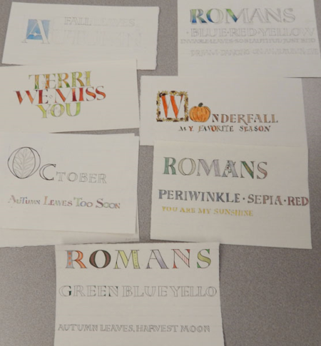
    For the workshop I taught in Tacoma on October 17, my lessons were based on making versals using monoline pens rather than the traditional tools (quills, primarily) used on historic manuscripts. All the students in the class showed how observant they were in following the examples I gave them. In their examples below, you can see the range of variations they came up with (click on the photo for a larger view): 


    Group

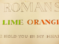
    After carefully drawing their letters in pencil and then inking over the pencil, students applied all kinds of decorative techniques to their letters done in different sizes. The monoline pens are very user-friendly, allowing calligraphers to create these letterforms in unlimited sizes. Note: these letters are not altogether drawn with the classic proportions of Trajan Romans. I selected the word ROMANS because it incorporates several letters that require us to learn the sequence of strokes while making them.

    DSCF2309After warming up to the letter forms by first tracing them, the participants pencilled the letters and then inked them at 1" and at 1/2" heights. They then drew them at 1/4." If needed, they could draw them at 6" or a foot, even. For smaller letters and decorations, a finer-tipped pen was used. Once the letters were inked, watercolor or colored pencil was added in gradients, patterns, or solids. The goal of learning to make these letters was to have an alphabet that can readily be used for titles, signage, journal enhancements or cards. 

    Prayer

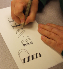
    Precisely drawn letters are filled with graphic embellishment by Sandra W.

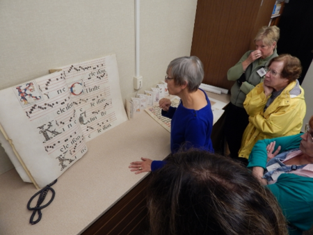
    I brought in several antique manuscripts* that featured various kinds of versal letters including some that were similar to the basic form we were working on. Other versals were extremely ornate, such as the penmade cadels (thank you Sandra for that term!) that show in the photo below. The group of students was interested in what I pointed out about this manuscript on vellum from about 1600 AD. It came from a religious house in Spain and was purchased by a family friend in the 1960's.


    New Mexico trip Oct 2014 1203 (640x480)

    A monumental antiphonal manuscript is discussed during a work break. A note to my students: the four-line staff did not go extinct with the development of more complex musical forms. Rather, it was restricted to Gregorian chant while the five-line staff served polyphonic musical composition. This clarifies how one small manuscript in my possession is dated 18th c. but has four-line staffs. *A side note about availability: one can still buy such manuscripts but from collectors and galleries only. A quick search online revealed this. A more rustic single page can cost in the 100's, but a more skilled and elaborate page would be in the thousands.


    In everything

    Small (1/4"), colorful letters with added dropshadows make this line of writing stand out. Very nice work! Thank you Tacoma Calligraphy Guild, Terri Kruger, and Randi Kander for inviting me to teach and for managing the day. To my students I also give thanks and I encourage you to keep up the excellent work! (Photos by Randi Kander and Jocelyn Curry)
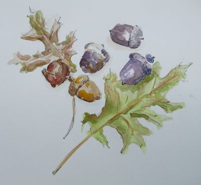
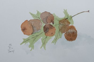
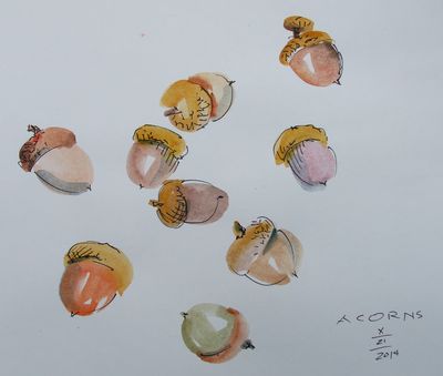
  • Today for the drawing group subject I sprinkled my acorn collection on the dining room table. We pulled out our watercolors and pens and with no initial pencil drawing first, we lit into our paints and each captured, in our individual ways, the little darlings of autumn. "Working loosely," which was our aim, is easier said than done. I think the results are gems:

    DSCF2313

    DSCF2317

    DSCF2315

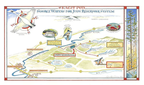
  • Complex assignment projects appeal to me. I've had enough of them throughout my career so that if enough time goes by after the completion of one, I get to hankering to take on another. Earlier this year I posted another artwork from the same project for which the artwork below was completed in late January of this year. Both artworks are now installed in the Control Building visitors' area at the Skagit County PUD Judy Reservoir Water Treatment Plant. The installation is open to visitors so if you'd like to see a 7-foot version of this map on the wall there, you may schedule a visit and a tour of the facility!

    Source Waters Overview

    I used Rapidograph pens and watercolor for this illustrated map showing where all the water comes from for Judy Reservoir. My work began with a tour of the water treatment facility. I took home a collection of survey maps and photos I took during the tour. To be honest, I was overwhelmed; where on earth would I start? This map came to me first. The original is about 10"x14". To view a larger image, please click on the map.
  •  

    IMG_0630

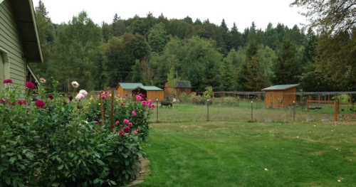
    Spacious pastures, clean shelters and the open skies greet rescued animals when they come to Joplin's. The dahlia beds provide ample bouquets which are sold as fundraisers for this non-profit shelter. Click on this photo to go to the sanctuary's website. You may make contributions there.

    Our intrepid little drawing group packed up our supplies (including cookies to munch on as we drove) and traveled to Joplin's Sanctuary & Animal Rescue in order to see the operation and sketch some of the animals dwelling there. After an inspiring tour, we were ready to position a bench so that we could try our hand at sketching some furry, moving subjects.

    IMG_0628

    One of our members made sit-upons for us to use when we draw while out in the elements. They've been used in gardens, on beach fronts, and now: on a farm. We three tucked ourselves onto this bench for our sketching session.

    We posed the question: who should we draw? The rescued goats, now very friendly and well-fed? The newcomer chickens found by the highway in a cast-off cardboard box?  The duck who had survived several brutal attacks by humans, now in the TLC of Byron and his crew? We opted for the goats and the duck ("Quasimodo," affectionately called Quasi).

    DSCF2232

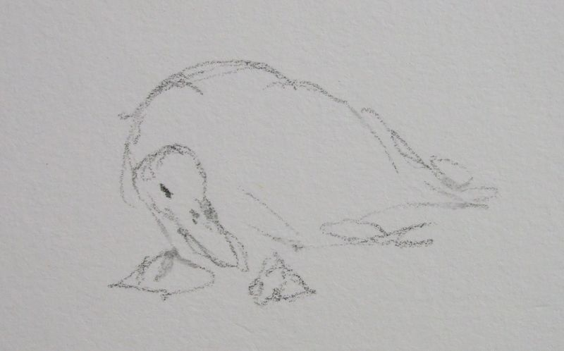
    Quasi's distorted neck doesn't keep him from quacking a friendly greeting while approaching people, including us.


    DSCF2236


    Goats in grass copy

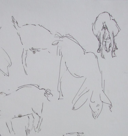
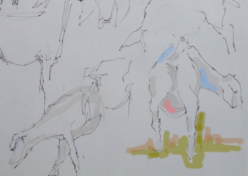
    Goats are especially cute from the rear! They challenged us as they do not stand still for more than a couple of seconds. Two of us did pages filled with gestural sketches. I added some digital color to mine in Photoshop.


    IMG_0626

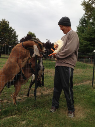
    Founder Byron Wilkes gives Quasi a chance to be eye-to-eye with the gentle, curious goats. The popularity of goat milk products has led some entrepreneurs to keep large herds in unhealthy, restrictive conditions with inadequate vet care. Joplin's currently has two pastures with shelters for goats.
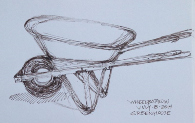
  • Of our little group of three, two of us have greenhouses. Earlier in the summer we drew a wheelbarrow in one of the greenhouses, and recently we tackled a garden glove as our subject while sitting in my greenhouse. Here are some of the results: 

    DSCF2044

    Here, the garden glove was sketched right onto the same page as the wheelbarrow, creating a nice study.
     
    IMG_0237

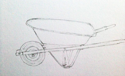
    The angles in this drawing are accurate, causing the wheelbarrow to look stable even though no floor is depicted.
     
    IMG_0231

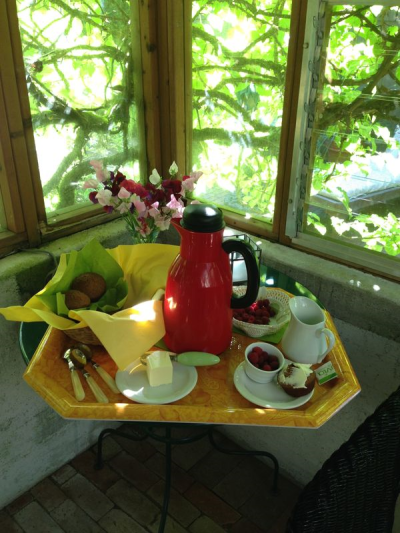
    Lest we forget one of the pleasures we indulge in each time, I'm interrupting the series of drawn images to show you what awaited us in the greenhouse the day we drew the wheelbarrow.


    IMG_0236

    Many things about my wheelbarrow are wrong. And it was "wrong" to use a pen for this exercise. A pencil would have been a lot neater..


    DSCF2046

    …and my glove had a few problems, too! Although now, a week after drawing it, it doesn't look so bad to me. I like it when that happens.
    DSCF2048

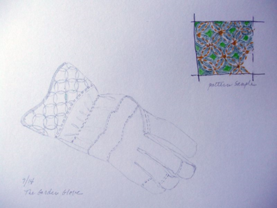
    One of us particularly loves detail, and this page reveals that. The stitching and the precise pattern of the print on the cuff of the glove are carefully recorded.

    May some of your summer drawing interludes also be shared with friends. I highly recommend it!