Jocelyn Curry

Art & Joie de Vivre

  • Yard map wildlife Yard map 1
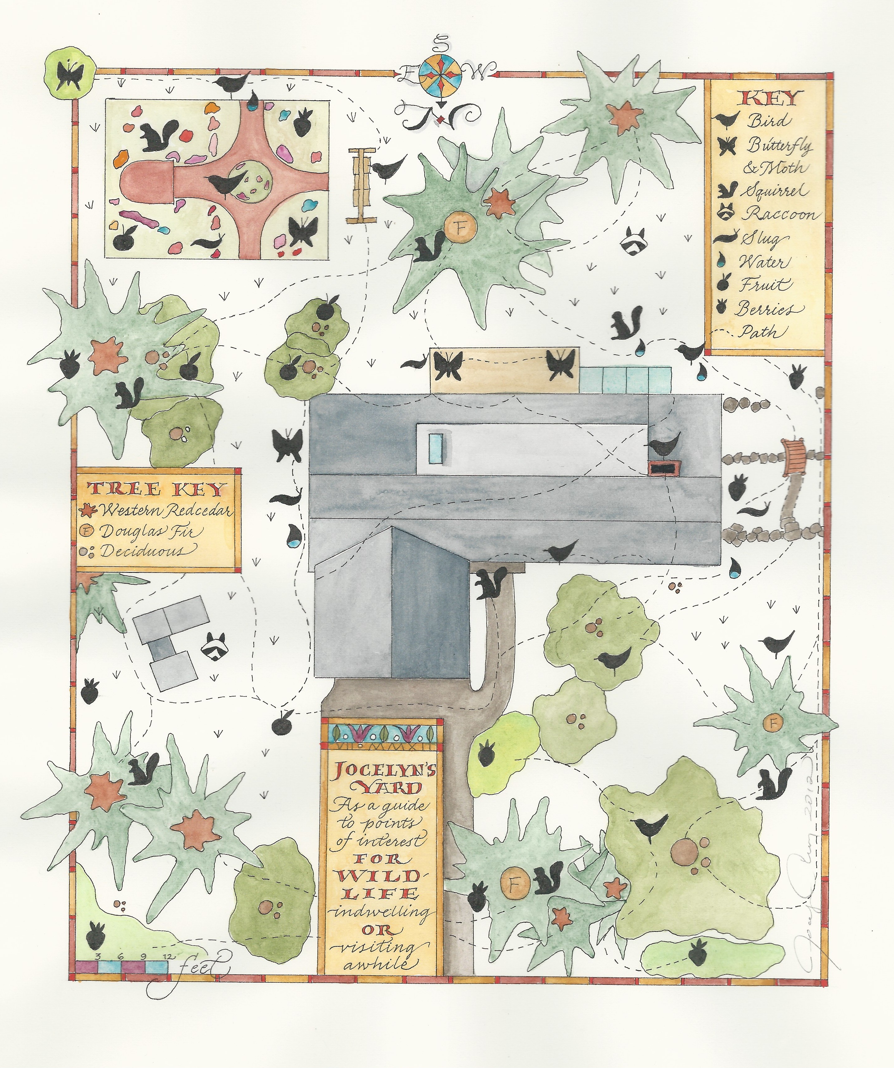
Offering new techniques and approaches to making maps by hand is an important part of my teaching workshops on this subject. For example, when the springtime wildflowers started blooming in my yard last year, I decided to try a mixed media version of the original wildlife pathways map I made two years ago. This map, above on the left, was created by my pacing off by foot our property and house structure. The original was done in ink and watercolor. I wanted to try something new to suggest to my 2015 "Artful Map" students at the North Cascades Institute Environmental Learning Center. ("ELC")

    Buttercups, forget-me-nots and star flowers are represented on my second yard map using rubber stamped icons. The legend at the lower right itemizes these icons. In order to render a softer look to the other map elements, I used graphite and collaged pieces of vintage, commercial maps (softened first by painting a thin layer of gesso over them). The substrate paper is an Indian handmade sheet whose border was also painted with gesso for contrast and to create a surface for the graphite writing.

    Are you interested in taking this unique workshop in a residential retreat location? It is scheduled for June 24-26, 2016 at the ELC: Read and Register HERE. A big bonus for those who attend my workshop will be the concurrent teaching of John Marzluff's In the Company of Corvids. Marzluff, a professor at the University of Washington, is one of the pre-eminent research scientists and teachers of corvid (crows, jays, ravens) bird behavior. Evening programs at the ELC will feature his fascinating videos and lectures. 

    Please see my general page on all currently scheduled 2016 workshops HERE. 

    NEW: An introductory map drawing workshop will be held in Sidney, BC (Vancouver Island) April 16 and 17, 2016. A downloadable brochure for this can be found on the 2016 Workshops page. I will post more on this soon.

  • The morning was nippy but the three intrepid Drawing Group members perched in the shade of Old Mill Town in downtown Edmonds, WA a year after our first foray to draw there en plein air. This time, we selected one plant instead of the entire facade of the buildings! (Getting wiser). We enjoyed the more limited drawing subject as we sipped our coffee and talked about whatever crossed our minds. Here are the results:

    IMG_1764 (1)

    We all agreed that this was an elegant rendering of our subject. The paint was put down first, followed by fine, uniform ink lines.
    IMG_1767

    Sensitively drawn as though it were growing through an open window, this rendering seemed complete in pure and simple graphite.
    IMG_1760 (1)

    My drawing looked better with my paintbox underneath it. I'm not sure if that's good or bad, but I suspect it's not good!
  •  

    IMG_1880

    Original artwork for letterheads

    Ask any calligrapher if they own a Speedball Textbook and I'm quite sure they will say "yes." My first calligraphy instruction book was a Speedball Textbook published in Spanish. It was free due to the oddity that it had been shipped in error to my employer at the time. Why did I want it? Because it was time to address my own wedding invitations and I needed to learn to do calligraphy (I'm not the only naive one who has fallen into this trap). The small paperback volume has always been chock full of samples and step-by-step instruction for aspiring pen users. Even the most recent edition will include pages of instructional alphabets by the original author and artist Ross F. George who published his first edition in 1915. Yes. It's been a hundred years, and the useful booklets are still on the market. 

    My purpose here is not to write a biography of George, but to write a little bit about an illuminating trip my friend and fellow lettering artist Katherine Malmsten and I took to visit his granddaughter Suzanne George Yourkowski, now the caretaker of all the original artwork included in the Textbooks. Her grandfather died in 1959, and Suzanne's father left the collection to her. We were graciously received by Suzanne after our trip across the mountains from Seattle to Cle Elum, Washington. Spread out before us in Suzanne's home was quite an overwhelming collection of original paste-ups and originals George had done for his publications. Because he was also a sign painter who owned a sign business in downtown Seattle, samples from this part of his career work were also in Suzanne's collection. I photographed a few items so that I could do this post, but the entire collection has been scanned for use in what we all hope will be a comprehensive biography of Ross George's work.

    Speedball caps

    Scan from my 1972 20th Ed.(Hunt Publishing Co.)


    IMG_1874

    Ross George's original work for an early edition (click for a larger view)

    Above you can see, on the left, a page scanned from my Spanish language 20th Edition Textbook. On the right is an original exemplar done by George. The original is slightly different (possibly an earlier version) but the overall model style is the same. The intricate touching-up of the original artwork is meticulous. 

    IMG_1876

    Labor-intensive work went into every model sheet created by penman Ross George.

    Familiar to many Textbook users is the exemplar to the left. Because calligraphic styles done with pointed steel nibs (pen points) are currently enjoying a broad popularity, this model is no doubt still being heavily referred to. Here you can really see the extensive retouching George did to make the letterforms appear nearly perfectly made when reproduced in his books. Surprise! Even the masters of our craft resort to correction fluids. Practitioners of calligraphy know that one-off perfection is beyond our human reach. 


    IMG_1896

    My treasured keepsake by George is 9"x14" and was probably seen in Seattle menswear shops in the 1930's or 40's.

    Suzanne spent five hours with us as we pored over the collection. Keeping us supplied with fresh coffee, homemade soup and bread, Suzanne also answered a lot of questions and allowed us to feel completely comfortable in our hands-on examination of her grandfather's impressive life's work. Wouldn't you think that we would be the ones to offer something in return for this valuable experience? Just when we felt indebted to Suzanne, she gave us our pick of a handmade sign from Ross George's illustrious career as a sign painter. I should have photographed Katherine's, but didn't think to because I had fallen in love with my own pick: Cloth Hats for Fall. I am a hatmaker, it is fall, and this perfect little tutorial message is handwritten in pencil on the back of my treasure:

    Showing how the surface of rough finished mat boards can be effectively emphasized by airbrushing with a side shot. Note how the lettering treatment harmonizes with the subject.

    Clearly, George loved letters and their expressive potential even if they were humbly drawn for a shop window sign.

    Thank you, Suzanne George Yourkowsky, for a memorable day and for your kindness to Katherine and me!

    IMG_1885

    Katherine communes with Suzanne's two alpacas. The beauty of Cle Elum's surrounding landscapes made our day together glow all the more.

    Postscript: My work was included in the 23rd edition of the Speedball Textbook. Katherine's work is included in the upcoming 24th edition of this classic. Click to go to the: Speedball web site. 


  • When I turned 11 my birthday gift from Mom and Dad was a Samsonite Train Case. Come summer, we were to travel to Casablanca, Morocco to live. My new white train case with its pale pink, quilted satin lining represented my independence from my parents, my own minute, portable storage space. 

    So it was especially poignant to me one morning a few weeks ago when one Drawing Group member presented us with a still life featuring her mother's train case from the 1940's and a pair of olive green gloves. We nostalgically told each other train case stories, describing our own beloved ones to one another before beginning to draw this one from the 1940's:

    DSCF2855

    Where did the gloves go? Drawing the train case provided various challenges. Capturing the perspective (very nicely done) overwhelmed one member so that she unconsciously omitted the green gloves. See how visual information can be edited out by our brain/eye/hand processes?


    DSCF2860

    The daughter of the train case owner wanted to do a pen and ink sketch with added water for a black and white drawing. This one would be right at home in The New Yorker.  
     
    DSCF2858

    The colored version of the train case. We in the Drawing Group are all working on a looser watercolor approach in our sketches.
       
    Train case

    Here is my train case sketch with the drape that was used around it.

    My own train case is still in my mom's possession. It no longer travels on trains, but I'm thinking of reclaiming it and taking it on a trip via Amtrak. Being built to withstand many years of use, it served as a handy seat in many an airport and possibly in a few train stations, too. 

  • On a few occasions I have been told emphatically by students and colleagues that Prang watercolors, an elementary school staple, are lightfast except for the yellow (according to one professional user). I have nothing against Prang paints, and for $10 they are, in my view, a bargain for the 16 color set. For youth classes and for workshop attendees who don’t want to invest in artist quality paints, they will do just fine. But lightfast? Some of the colors appear to be more stable than others, but 9 of the 16 colors in my set purchased in 2014 degraded significantly if not fatally after 7 months of light exposure:

    DSCF2841

    The color samples were created on November 20, 2014. One set was placed on an east-facing windowsill in my attached sun room. The control set was kept out of direct light in my studio.

    In row one, the only colors that did not degrade are the three on the right: ultramarine blue, brown, and black. The three warm colors on the left faded considerably as can be clearly seen.

    In row two, even the white essentially vanished after 7.5 months. The magenta turned pale blue. The orange turned pale yellow except where a concentration of paint puddled. Or, more likely, perhaps the row one color strip lay across a corner of the row 2 strip to protect the orange and the lower half of the red. 

    I can still recommend the Prang watercolors for exercises done in workshops or for children. But for work that you want to preserve, invest in a small pan set or tubes of high quality paints. 


  • IMG_1358

    Colonial Peak and Pyramid Peak at sunset. To see larger views of all photos in this review, please double click on the image.

    How does one go about designing an "artful map?" The process is complex and time-consuming but there's no better place to do it than at the North Cascades Institute Environmental Learning Center (ELC) For this shorter version of the workshop (the original was a 3-day format), participants need to get a fairly quick start, which this year's group definitely did. Some came with reference materials for a map they had already conceived of, and others drew from the inspiration of the ELC's dramatic location for their maps. Below I have posted some of the in-process and later photos of the beautiful work the 11 students did from June 26-28. To view more of the participants' work, and some of the participants themselves, please click on the link below which takes you to a Flicker page hosted by the Institute:

    https://flic.kr/s/aHskexCvHY 

    Note: most of the maps will be completed at home, with updated photos to be added here:

    BilliesTrail

    The Pacific Crest Trail was the subject of Billie Butterfield's map. She and a friend have hiked multiple sections of the trail. She designed many simple icons to mark events and landmarks along the way. Sections of the trail will be color-coded and shown on the legend.


    PatriciasBaby

    Not all maps are conventional way-finding documents. Patricia Ressiguie, who is a three-time student of this class and has each time designed conceptual maps featuring images with map elements, combines topographical lines, a short text, and a sleeping baby in this mysterious map. About this one she stated, "Right now I don't know what this one means."


    DSCN1476

      IMG_1375


    Above on the left you can see Bob Theriault referring to an existing map to help him place the significant geographic points on his hand drawn map of the same general area. He used the tea-dyed paper I provided as an alternative to the white option. His map depicts all the locations of different warblers he has spotted over the years. At home he'll add the title and a key, both elements that define and enhance an art map. 

    IMG_1365 IMG_1376


    A typical classroom desk looks like Patti Green's, above, during the initial design process. Many reference materials help with creating icons or illustrations of plant or animal species found in the ELC locale. Her pen and ink map with some color added is on the right. The green/blue color of the water is not artificial; the color of Diablo Lake resembles this hue. Patti was inspired by the picturesque Peninsula Trail which is lined with wildflowers, native plants and trees. From the trail is a breathtaking view of Colonial Peak, the lake, and dense forest.

    CarlieWorking

      Unnamed


    Carlie Holland, after many hours of pencil drawing and plotting out of all her map features, arrives at the point where she can ink in her pencil rendering. Her map is a pictorial representation of the daily walk she takes in her home town in British Columbia. Colored pencil application followed inking with a Micron Pigma .005 pen. 

    Students are encouraged to transfer their map elements by using light tables to see underlying drawings on tracing paper, and tracing their images onto their final paper. Why? In the end, this practice reduces risk, saves the pristine surface of the hot press watercolor paper from multiple erasures, and allows the designer to adjust the layout of their composed maps with a minimum of experimentation on the final map. In five years of teaching this class, I haven't seen one piece of final map paper being scrapped! Students only receive one piece of white paper, and one alternative. That probably has something to do with the success rate. There are no art supply stores in the North Cascades.

    DSCN1479

      MaryAnnCamano


    Above on the left is Mary Ann Weeks using the light table to transfer her map of Camano Island, her home. Creating maps of home can be fulfilling because all that is meaningful about a place can be represented with motifs, paths, dwellings, and even journal notes. Everything on these hand drawn maps has significance to the designer. 

    IMG_1370

    IMG_1371


    Laura Ridder's map on the left and Leeta Anderson's on the right both depict popular trails on and around the Learning Center campus. Laura used colored pencils and Leeta used watercolors. Both employed the age-old color principle in cartography where land masses are usually represented by warm earthen colors and bodies of water by blues and greens. Both chose prominent, contrasting colors for the trails themselves, thus giving them importance. Both maps will be completed with more color added.

    IMG_0258

    Leeta's completed map. The ridge of mountains at the bottom of her piece represents the view one sees when on the Peninsula Trail loop depicted directly above.
    IMG_1372

    In both the maps above, the designers chose to organize information in boxes (illustrations will be drawn in them). Ellen Tennis' "Camp Hamilton" will be completed as a camp memento gift.
    IMG_1378

    Illustrations of the blossoms of featured trees will be placed in the boxes that create left and right borders of this site map. Tracing paper is a handy material for visualizing layout changes. Sally Theriault also used tracing paper to experiment with color rather than put color directly on her final paper.


    DSCN1480 ErinMap 


    Erin Hickey designed her map so that significant animals are featured in various western states. Her color scheme, including the tea-dyed paper, was inspired by vintage maps and other ephemera of the west. The use of colored pencil gave her more careful control in applying color. 

    Thank you, Lauren (our graduate assistant who took the photos for the Flicker site) and Katie Roloson (our program coordinator) for the many ways you made our workshop experience and the residential experience so outstanding. From the ice water in the classroom to the comfy excursion to the Happy Creek Trail for Saturday lunch, Lauren catered to our needs. To learn more about the North Cascades Institute and their impressive mission and curricula, please visit their website:

    http://www.ncascades.org


  • The three of us itching to have a little adventure, we decided to ride the rails to Vancouver, BC in May. There was no shortage of points of interests on our lists: we visited the Vancouver Art Gallery, Stanley Park, Granville Island, and the Sun Yat-Sen Classical Chinese Garden before walking from there back to the grand Pacific Central Station for our swift return to Edmonds, WA. Sketching the sights was not the main aim of this trip, so while we each did a bit of it while in Vancouver, here are three finished pen, ink and watercolor sketches completed after we returned home:

    Sylvia

    The iconic Sylvia Hotel at the edge of Stanley Park was where we lodged. Not only that, but it was an early childhood home of one of our members! Her father was a toddler while living here when the Sylvia was an apartment building. And it was this member who was the one courageous enough to draw it.


    Vancouver sketch

    After we finished a general tour of the Dr. Sun Yat-Sen Classical Chinese Garden we took a few photos and then headed out into Chinatown to find a lunch spot. Once home, I focused on this one building in the series of structures that created the enclosed courtyard. In all of our sketches, the main challenge was what to render and what to merely suggest.
     
     
    IMG_1321

    The Sun Yat-Sen Garden made news here in Seattle when it was being constructed in the 1980's. Thus, we all wanted to tour it. A serene gem in the heart of Vancouver, the garden inspired this composed journal page.
  • As an example of a "Personal Letter as Manuscript" the letter below was written by me to the students who had signed up for the mini-workshop I taught on May 2. Twenty students went right to work last Saturday at the Letters of Joy conference at Edmonds Community College. Watching these calligraphic artists launch into writing their letters was a moving experience. I took some photos of their work, but then realized that these were personal letters to real people so I will not post them. Kudos!! to all of my hard-working students.


    Letter to students

    A vintage Schaeffer calligraphy fountain pen (fine) and colored pencils were used on 8.5" x 11" Crane's stationery. I designed a lining guide that includes borders and boxes for placement of initial cap letters (versals). Gold gel pen was used to enhance the artwork and writing.
  • The Drawing Group has been convening for 5.5 years now. It's not uncommon for us to look at each other over fresh coffee and breakfast pastry and say, "What shall we draw?" One day last month while my granddaughter was visiting, a collection of her stuffed animals was on a chair at the table. Voilà: our subject du jour (don't we all speak a tad of French?). 

    Here are our results! Drawing fur is not the easiest of tasks, but at least these critters sat still for us:

    DSCF2694  DSCF2693 (1)

    DSCF2695

    Because the "still life" is in one position and we are looking at it from three viewpoints, the trio of sketches shows variety. We often talk about what was difficult about our perspective. My sketch is at the bottom. Fur takes a while to sketch, so none of these is a finished sketch.


  • Newfork

    Ode to a Garden Fork

    Poem and Illustrations by Jocelyn Curry


    I first saw you

    on a day dim with January light

    while the baby napped

    and joy was but a memory

    pasted and closed within

    a shelved album. 

    Outdoors the earth was frozen,

    closed for the winter,

    the sign saying 

    Stay Away.

    I obeyed, reached instead

    for the Smith & Hawken

    catalogue, the warm wishing well

    for gardeners banished by the cold.

    You were on page 23:

    Bulldog Garden Fork,

    Drop-forged steel,

    Filled-Y ash handle

    Handmade in England

    Lifetime guarantee.


    Your tines

    were four-sided spears                                                   

    tapered and ready to

    pierce and lift at my command,

    eager to find stones

    left carelessly behind

    by the glacier 

    that was once my neighborhood.

    The smooth, golden wood

    of your eager up-stretched handle

    was your invitation to toil

    hand in hand with me.

    Your gleaming image

    became nectar and manna in one –

    without you I would be as weak as a brittle stalk,

    unable to till a single furrow.

    I filled out the order form,

    wrote the check and sent it off.

    Rock


    Time passed as slowly

    as lichen grows upon a stone.

    At last, in late February

    you arrived on my porch

    a boxed Bulldog,

    my winter savior,

    my English Adonis!

    I slit the tape,

    opened the box,

    and lifted you in wonder.

    Your handle was not wood,

    but molded amber.

    Your tines were not metal,

    but forged light.

    I rushed you to the garden,

    where the frost had heaved and crusted

    the soil of our Eden.

    I pressed my foot onto your steel shoulder,

    plunging you into the earth for the first time.

    We married at that moment, 

    bound by fertile purpose.

    Cedarroot


    Many winters have passed since then.

    The baby is now 24. 

    Your shaft and handle 

    are the color of spores,

    the wood grain raised and rough. 

    The edges of your tines have softened,

    worn by basalt stones and cedar roots.

    Oldfork

    Once, on a wet day in April

    when the daffodils strained 

    against the rain,

    I thought someone had taken you

    from our garden.

    I searched for you as I would 

    for a vanished lover.

    But you were there,

    leaning against the fir tree,

    camouflaged against its craggy bark,

    your body resting, but

    your purpose unchanged.

    Relieved, I grasped you

    with my gloved hand

    and together we worked the soil.

    Garden gloves

    Poem written in 2005 as an assignment for a college class in poetry.

    Artwork done in 2007

    All content: copyright Jocelyn Curry 2015. For permission to use content

    please contact me via email.

    ~~~~~~~~~~~~~~~~~~~~~~~~~~~~~~~~~~~~~~~~~~~~~~~~~~~~~~~~~~~~~ 


    Post script: the baby is now 34. The fork is still in daily use:

    DSCF2640