The images you see here are previously published cards, images used in cards, and a few wrap and print images. With the exception of the Garden Journal, I own the original art which is available for licensing. For higher resolution images or to discuss fees, please contact me by email. For an enlarged view of this archive, please click on the image.
-
-
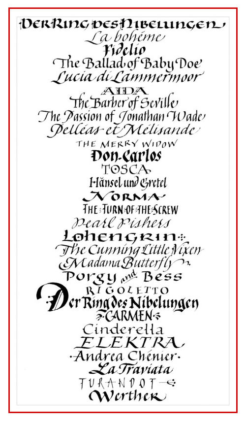
To demonstrate how straightforward calligraphy can help capture the meaning of words and names, I elected to change styles with every opera name in the column below when asked to do this commission for a retiring costumer for Seattle Opera. (Need opera now? Click this link for a few bars of the current feature.) Comedic or tragic, Germanic or American, the opera names each suggest stylistic treatment. This calligraphy was freely written and not retouched. Is your favorite opera listed here?
-
All artwork* on all pages and posts of this website are Copyright Jocelyn Curry 2015. No type of reproduction of any image may be made without the permission of the artist. Commercial use of any of the images on any page or post of this website is expressly forbidden and subject to litigation unless usage fees have been paid to Jocelyn Curry.
*Logotypes on the page Logotypes with Visibility are under copyright by their owners.
-
Jocelyn Curry
Education
BA General Art, University of Washington, Seattle, Washington
Graphic design coursework, School of Visual Concepts, Seattle
Classes, seminars and workshops in calligraphy, lettering, painting, graphic design, business management, and poetry 1984–PresentSelf Employment
Sole proprietor of Jocelyn Curry Calligraphy and Illustration, 2001–Present.
Calligraphy, greeting card illustration, logo design, lettering and illustration for the graphic design industry. Clients include Sellers Publishing, Papyrus (previously Schurman Fine Papers), Seattle Chocolates, Food Services of America, Nordstrom, Inc., Tamarack Cellars.Sole proprietor of Catchwords, 1992–2001.
One-of-a-kind custom calligraphic work for individuals and companies, lettering for catalogue titling, logo design and packaging.Sole proprietor of Jocelyn Curry Lettering & Design, 1986–1991.
Graphic design for small businesses, traditional calligraphy, and fine art commissions.
Solo ExhibitionsThe Cedar Branch Chronicle, Wessel & Lieberman, Seattle, 2007-2008
Suspended Poems, Edmonds Public Library, 2005
Retrospective, Edmonds Art Festival Museum, Edmonds, WA, 2003
Uncommon Manuscripts, Edmonds Community College, Lynnwood, WA, 2003
Literature and Collage, Writing Center Gallery, University of Washington/Bothell, 1998
The Letterbox Series, Recent Works Wessel & Lieberman, Seattle
Pen Visions/Brush Songs, The Calligraphic Art of Jocelyn Curry; Arts Council Gallery, Everett, WA, 1991Selected Group Exhibitions
Flourish II, Calligraphic Works by Northwest Artists, Seattle, 2005
The Art of Calligraphy, Arts Council Gallery, Everett, 2003
Flourish, Calligraphic Works by Northwest Artists, Seattle, 2002
Celebrating American Poetry, Frye Art Museum, Seattle, WA, 1998
Calligraphia USA/USSR, international traveling exhibit, 1989-1995
Richard E. Beasley National Invitational Tribute Exhibition, Flagstaff, AZ, 1993
It Is Written, invitational calligraphy exhibition, Spokane, WA, 1986
Selected Publications Featuring Artwork by, or Articles about the ArtistThe Crafters’ Devotional, 365 Days, Barbara R. Call, Quarry Books, 2009
Complete Color Harmony Workbook, Rockport Publishers, 2007
Letter Arts Review Annual, 2006, 1994, 1993, 1988,
Artists’ Journals & Sketchbooks, Lynne Perrella, Quarry Books, 2004
Tabellae Ansatae, Vol. 2, No. 3, Artist Profile, 2003
The Calligraphers Engagement Calendar, John Neal, Bookseller, 2003
Somerset Studio, Vol. 1, No. 3, Artist Portfolio, 1997
Paper Art, Watson-Guptill, 1997
Pen Calligraphy, AHA Calligraphy Series, Fran Strom, 1996 The Creative Stroke, Richard Emery, 1992
Excellence in Lettering & Typography, Horvath & Lobato, 1992
Florilège, Alain Mazeran Editions D’Art, 1987
Selected InstructionNorth Cascades Institute Instructor for adult art classes, 2008-2015
The Sequential Class, a two-year course for calligraphers, Edmonds, WA, 1997-2007
Letters of Joy, annual regional conference for calligraphers, book & paper craft artists,
Lynnwood, WA, 1989-2015
Soundings, 16th International Calligraphy Conference, Tacoma, WA, 1996
Itinerant Workshop Instructor in the U.S. and Canada, 1990 – PresentVolunteer
HopeLink Foodbank, Shoreline, WA 2009-2012
TeenHope Emergency Shelter, Shoreline, WA, 1998-2004
Board of Directors, Write On Calligraphers, Edmonds, WA. 1985-1994,
2002-2005. Positions included: President, Vice President, Ways & Means, Exhibits, Workshops, Director and co-Director of Letters of Joy regional calligraphy conference, Newsletter Editor (1985-1987, 2002-2005). -
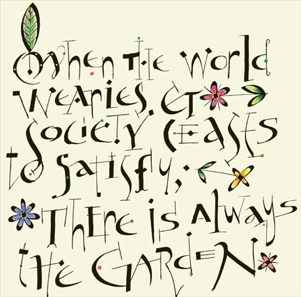
I think this is true: many calligraphers are drawn to the craft because they love structure, detail, and disciplined letterforms. But given a sudden lapse in conformity, calligraphers can cut loose from all this and let the pen do the walking. Such a lapse happened to me recently, resulting in the composition below. The words are quoted from Minnie Aumonier, the pen used was a Speedball C-2, with the color added digitally after the unretouched calligraphy was scanned into PhotoShop:
-
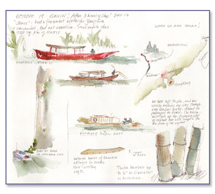
I have kept travel sketchbooks since the summer after I turned 12. That
summer, to help stave off homesickness, I kept my first little journal
while traveling with our French neighbors from Casablanca to their
villa near Carcasonne in southern France. Recording my thoughts and the
passing sights in a tiny spiral notebook gave me a feeling of
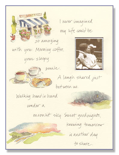
connectedness I needed then, as a jeunne fille traveling without my family. I continue to keep sketchbooks when I travel today.A few years ago it dawned on me that my "sketchbook style" of drawing
and painting might be of interest to my clients as an expressive
illustration style. Because of its spontaneous quality, it has an
appeal. Here I am posting two pages from my recent sketchbooks made
while traveling in China (click on the photos for large versions of the
pages). Below them you will see a greeting card designed for Papyrus,
where the handwriting is much more legible because I was doing it in my
studio and not while bumping along the roads on a tour bus or swaying on the deck of a river boat!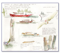
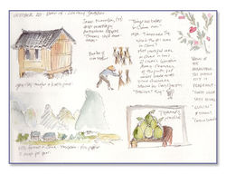
These pages feature the many types of small boats seen on the rivers of China and passing images from the farmlands. The Papyrus card below features a series of romantic images applied to a Valentine's Day card. A photo of the buyer's choice is to be placed in the cut-out window.

-

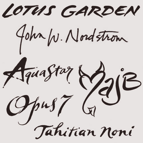
Do any of these logos look familiar to you? They are all my work, in the elemental black & white form, before being applied to their ultimate products. To see how these logotypes are currently in use, please visit my new portfolio page by clicking on this link: Logotypes with Visibility (this page link is also located to the upper left of here under Design and Teaching). Once open, the page will show the individual logos with a link next to each logo on the page. Click on these to go directly to the sites to see how the logos are used effectively by companies and organizations.
Working with clients to create logos is one of my very favorite professional activities. The collaborative process is something I'm always eager to engage in. I never run out of ink, nor ideas. For estimates or printed sample booklets of my lettering, please contact me.
-
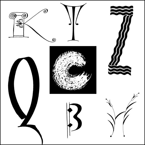
When I work with clients, I take plenty of time to create numerous sketches so that we can find the best design direction for their brand. On this page you see the completed lettering I submitted at the end of the design process. From here, my clients applied color and sometimes additional design elements. They then incorporated the new logotypes into their printed collateral, product packaging, and websites. Click on the links to see how the logotypes are used in publicity and advertising.


Globe Illustration for The Seattle Public Library, Art Direction by Bridget Culligan of Golden Lasso
No link – Greenwell Financial was sold and renamed.

Annual Quilters’ Fabric Stash Fundraiser Sale, La Conner, WA

Ruth’s Kitchen, Ruth’s Brownie Kitchen
Online made-to-order brownie and cookie company

Food Services of America Ethnic Brands
Nationwide restaurant food supplier
All-girl trad jazz band. Logo based on original sketch by Bria Skonberg.

A capella choir based in Seattle, WA
-
Lettering can also be drawing, which is one of the reasons I fell in love with lettering when I was in high school. With a full range of traditional and non-traditional tools in my studio, I’ll always be able to invent new styles or enhance classic ones. For custom lettering to meet your design needs, please contact me.

-
After featuring real and marzipan mushrooms in my previous post, there was keen interest in my making of the marzipan fruits and vegetables for my son and daughter-in-law's wedding cake. Happy images are still swirling about my mind (the wedding was Saturday!), while the marzipan was mostly eaten up by admiring wedding guests.
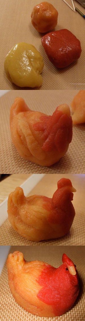
Here's a little tutorial for those who are interested in my techniques, basic though they may be. In the top photo, you see the three colors I used to create the marzipan version of Lucky, Eli and Amy's mascot hen. Plain marzipan is colored by adding drops of food color to a flattened ball of the natural off-white candy and kneaded by hand. (Use disposable gloves to protect from the darker colors.) A silicon baking sheet (Sil-Pat) is a good nonstick surface to use for forming the shapes.
In the second photo, I've roughly shaped a sitting hen, applying the more orange clay around the neck and breast of Lucky.
In the third photo, I've added Lucky's head, and have shaped her body in a more life-like, feathery way. The marzipan sticks well to itself, so you can build and model to your sculptural content.
In the bottom photo, you see that I added tiny bits of licorice for eyes, and I applied some straight red food color to enhance Lucky's comb and wattle. I turned her head to make her look more lifelike. Until it air dries for a couple of hours, the marzipan is soft and malleable.
Tips for coloring some of the vegetables and fruits as shown in the photo below:
Pears: mold pears (mine are about 1" high) in yellow marzipan. Dilute one drop red food color with a tablespoon of water. With a watercolor brush, lightly paint a pale pink tone along one side of each pear. Cut a licorice stem, inserting it after first poking a toothpick into the stem end of the pear. Cut a small leaf shape with a sharp knife, lightly press tip into the stem recession.
Potatoes: use natural marzipan, make potato-like impressions with a toothpick, then dust with cocoa powder after forming.
Wood: knead unsweetened cocoa powder into natural marzipan, adding more to darken the color.
Artichokes: darken green marzipan with some purple (useful for grapes), "marbling" it into the green. Use tiny aspic cutters to create artichoke leaves, pressing layers of them onto a small starter-ball of marzipan.
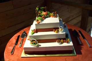 Here you see the cake with all of its marzipan placed upon its layers. Below is a close-up of the top layer, where Lucky is holding court while being surrounded by the harvest of fruits and vegetables. The split-rail fence was fortified by molding the marzipan around chocolate Pocky sticks, and allowing the sticks to extend from the bottom of the fence posts so that they could be pressed into the cake.
The tiny baskets were molded from white chocolate.
(Click on photos for enlargements.)
May Eli's and Amy's lives together be long, sweet and fruitful. Cheers!