Jocelyn Curry

Art & Joie de Vivre

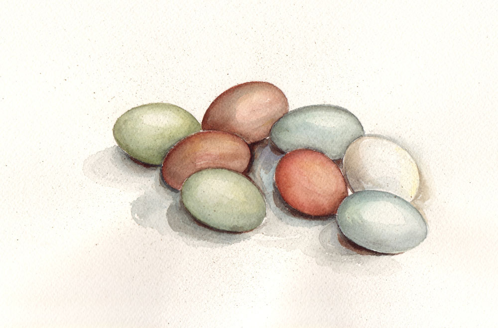
  • How beautiful are the colors of the eggs laid by the hens from our son and daughter-in-law's small farm! Looking at a basket of them, newly collected, never fails to inspire me to want to paint them. So, last week, in honor of Easter coming up, I did just that. Something slightly tragic happened during the time I was painting them, but before I reveal what that was, here are the hens that laid the eggs (minus the Leghorn, who laid the one white egg – she's probably off-camera in a nesting box, laying her daily egg): Correction: The Barred Rock hen lays pale brown/buff eggs, not green eggs. I now have my own Barred Rock and therefore, I know :-).

    Chicken yard

    One little aside: the egg has been used symbolically for thousands of years. It represent fertility (as do lilies and lambs) and new life, which is why it is associated with the festival of Easter, named after Eastre, the Anglo-Saxon goddess of the dawn and the spring.

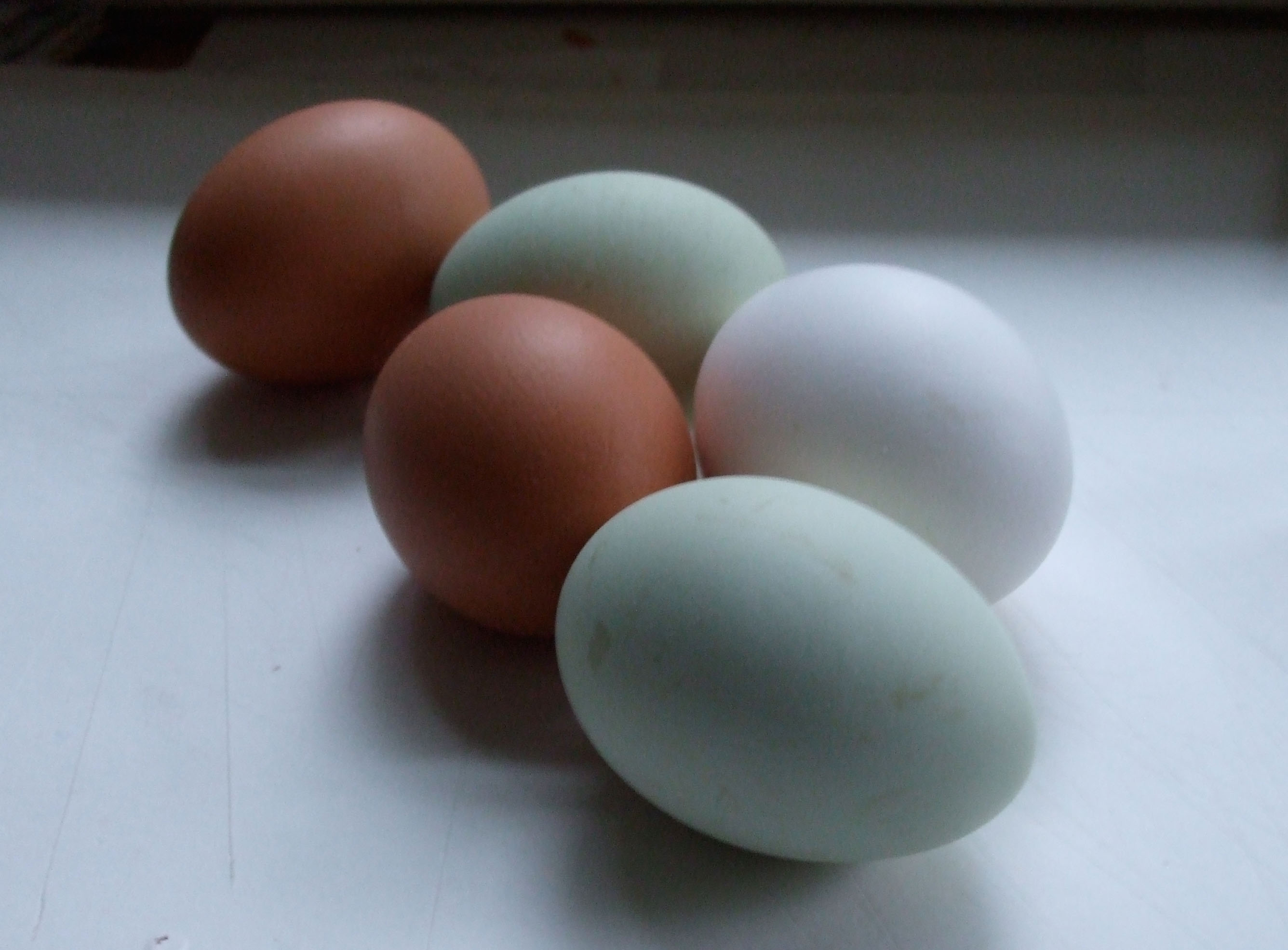
    To paint the eggs, I set them carefully on the small desk in my studio when the light of day was rapidly waning. During brief periods while the watercolor was drying on the sheet, I dashed into the kitchen to work on dinner preparations. I went back and forth a few times, drawing at first, then applying light washes of color to the egg composition. Here's a photo showing 5 of the eggs on my desk.

    Real eggs blog
    By the way, drawing and painting eggs is an excellent exercise in careful observation of shape and shadow! And, in the case of these eggs, a worthy exercise in subtle coloring.

    After I had some color on all the eight eggs, I made another trip into the kitchen to tend dinner, and upon my return, beneath the edge of my desk, this is the alarming sight that met me: 

    Broken eggs
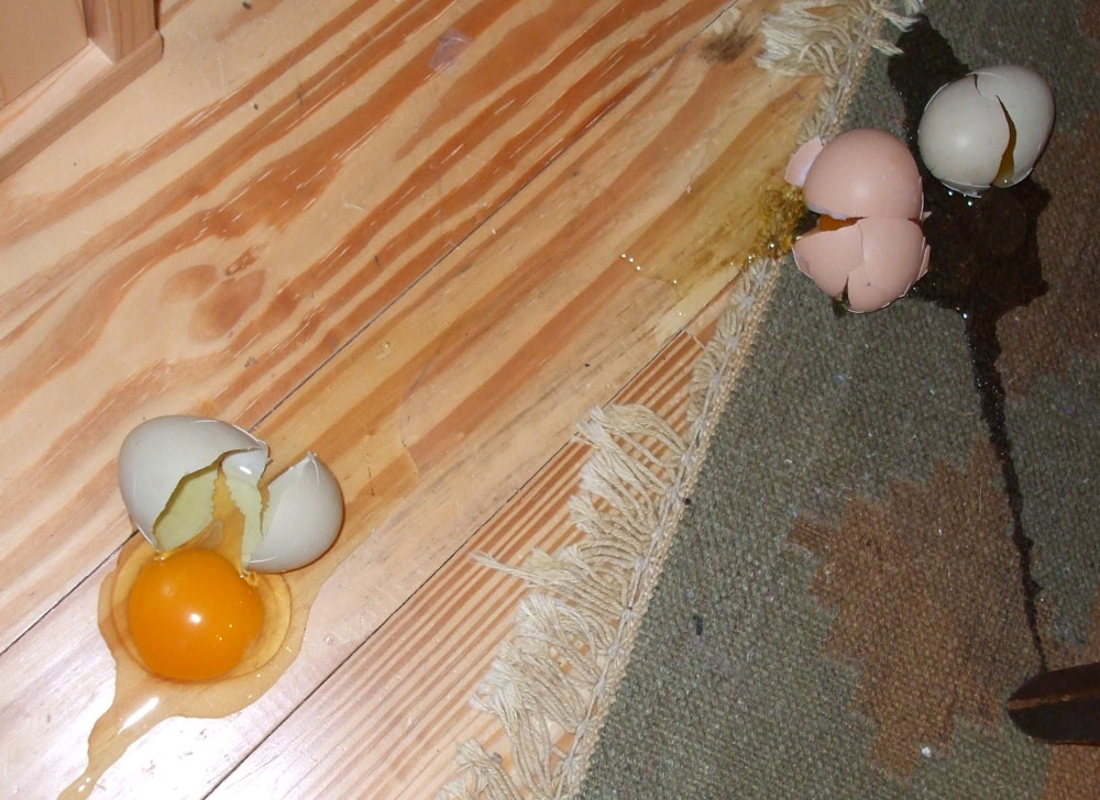
    Three of the eight lovely eggs had rolled off and smashed to the floor in my absence. Not only was it sad to lose them but my still life with 8 eggs was seriously impaired. So with very little daylight left, I pressed forward painting the five remaining eggs, imagining the play of light, shadow and color on the now-missing three. Dinner was served quite late that night, but my tribute to the Hens of Hazel Dell Farm and their beautiful symbols of new life was finished.

    Eggsfinblog

    Happy Easter, or happy spring to you!


  • Recording my daily life has always interested me, even when I was a child. Out of volumes of artwork I've done over the years, I've saved few of my off-hand journalistic sketches. Recently, while searching for something in the basement, I came across a page of drawings I did in March, 1967. They were done on the back of a sheet of my mother's historical writings about the place we were living at the time: Cadiz, Spain.
    JCsketches67

    Looking at this page, I remember my bedroom very well, with its single bed, handwoven Spanish bedspread, and my desk with my books. On closer inspection, I see that I was reading The Pearl. These items are recorded here, along with my napping poodle mutt Barby.

    Why put this page forth? As I look at it now, as one who teaches journaling and sketching techniques, I can see that my "style," such as it is, has not changed in all this time! A few ink lines contouring the subjects, a few details, and a quick, loose swipe of color or shading are all one need put down. This way of quickly recording images or full scenes serves me and my students well. I call it "capturing simplicity." If you are interested in taking a class with me, please write. Soon I'll be posting a page on this website describing upcoming study opportunities in addition to the North Cascades Institute (there, the focus will be nature sketching) page already posted.

  • Astoria Collage

    Two days away=a world away! We spent two nights on the Columbia River at the beginning of this week. Our digs were deluxe, thanks to a gift from Eli and Amy to stay at the beautiful and hospitable  Cannery Pier Hotel (NOT the place shown above!!) in Astoria, Oregon. Our perfect room overlooking the mighty river included a wine and cheese reception each afternoon, breakfast each morning, and 24 hour beverages and fruit bowl. We braved the late winter snow and hail storms to explore the steep streets of this historic salmon fishing and river port city where the remains of the old cannery piers rise from the river's edge like decayed totem poles. On our walk I took a photo of one stately but decrepit Victorian home belonging to Harry and Mary Louise Flavel, brother and
    sister, great-grandchildren of the bar pilot and entrepreneur, Capt.
    George Flavel, whose house is the most famous one in town:

    http://www.cumtux.org/default.asp?pageid=35&deptid=1

    A hearty thank you goes to Elleda Wilson, an Astoria photographer (www.astoria-photografpix.com) and history buff, for finding my original blog post and writing to tell me who owns the old, empty house and for sending the full story of the legendary Flavel family! And thanks to inquisitive friend Marilyn for her full search for details on the house and its famous residents.

    The abandoned house is in striking contrast to the beautifully restored Flavel House museum. The photo of the abandoned house inspired me to create a PhotoShop-facilitated collage. Above you see the layered image, and below, the original images I used to create it.

    DSCF3127
    DSCF3124
    Astoriamap 

    The house image was used twice, once as the straight photo, and once as a filtered photo. I placed the layers, adjusted the opacity of each, used a couple of filters on one of the house image layers (ink lines and poster edges). I erased parts of the map layer so that the house had some brighter white areas coming through on its siding. The center image above was taken of an ivy-etched concrete wall up the street from the old Victorian. After the images were manipulated, I added some handwritten notes for texture on the dominant house layer using my Wacom Tablet. The map image was scanned from an 1895 atlas page.

    (Today the counter for this website exceeded 5000 lifetime views. Thanks for reading!)

  • What a rare opportunity it is to create a new business as well as its graphic identity. This has been my winter undertaking, and it is now happily launched. Last fall I began to think about sewing embellished fleece hats to sell, after having made them as gifts for friends. This idea developed further: I would give 10% of the purchase price of each item I sold to two shelters, one for people, one for pets. Thus, the name Soft Shelter Hats came into being. The little millinery shop is online using the fantastic ETSY platform for artists, artisans & suppliers. Here are a few images and notes to show you how I went about designing the new company's logo and the little pictorial icons to go with it.

    Sshsketch

    My original sketch of the letterforms came easily. I wanted warm, friendly, highly-legible letters. I experimented with incorporating little images within the letters themselves. I also quickly sketched the beginnings of the separate iconic images I wanted to use in the identity.

    SSHoldlogo

    To the left you see my original finished lettering, which, although it fit my original concept well, I was not happy with. It looked too juvenile for how I wanted the business to be seen: one that would provide hats for all hat wearers. I had already drawn some of the icons using the same writing tool: a Speedball B nib pen, and was happy with those icons, so how was I to resolve the fact that I didn't like the name done with this same nib? They needed to match. The solution: start over using the same nib:

    SSHnewlogo 

    I liked this much better. I think the new lettering has a more expressive, contemporary feel. I incorporated the original lower case e and a, both of which worked for me. I feel that the new lettering is also friendly and legible, but not juvenile. To make it lively and fun, I bounced the letters, and used a dot instead of a crossbar in three letters. I alternated upper and lower case letters to create variety that I think helps. Below is the collection of Soft Shelter Hats icons and their verbal equivalents. It was lots of fun to draw these and I intend to use them in a variety of creative ways:

    SSH Icons 

    Please visit the online Soft Shelter Hats shop at Etsy. To the left of this central column you will see a representative sampling of the current collection. The hand-dyed cotton hats are by Christine, my partner in this start-up collective. Here's the completed banner for the little online hat shop. Please buy a hat and support the shelters!

    SSHfinaletsybanner

  • RemansoSunset

    In February 2008 I spent a week on the remote Osa Penninsula of Costa Rica. Part of the week was spent taking a workshop at the eco-lodge El Remanso. My instructor, Irene Brady, has posted a page-by-page review of my sketchbook on her blog. To view it, click here.

  • Saying goodbye to January always feels like a step toward spring. The dawn is coming earlier, and today, in my garden, the squirrels were chasing each other madly around the trunks of the cedars. While there's still frost on the rooftops in the morning, my mind is drifting toward planting time. As a salute to the hope that seeds represent, I've put together a small collection of artworks that demonstrates my perennial love for seed packages and gardening itself (click on the image for a larger view):

    Seed packets purpleblog

  • Exploring words
    and giving them life through hand lettering is always a fun challenge
    for a designer. Recently, my assignment was to create a logotype for
    two artisans whose business is called Two On A Lark. A great name for two creative women! I began with a plain ball point pen, seeing how the words could be stacked, emphasized, and styled:

    TOALsketches

    Two of many sketches were selected and developed. The top one is a more classic script style done with a pointed brush. The one below this was written with a felt marker in a more trendy, playful variation:

    TOALscriptlores

    TOALboxvar

    Numerous colored elements were added to both variations and the choices were circulated for feedback from discerning individuals representing a variety of age groups. A variation on the more playful version was developed further, with a casual script version of Lark plugged in, and color was added digitally. The logo was designed to be used online, on hang tags, business cards, and shipping labels. Here it is! Please contact me to learn more about my logo design services.

    TOALfin

  • This collection of greeting cards features a line-up of heart motifs used for Valentine’s Day and Mother’s Day cards. Many processes are represented here, from flat printing to foil embossed and charm-embellished fancy treatments. Various styles of informal and formal calligraphy are carefully matched to the styles of illustration. Contact me if you are interested in my illustration and calligraphy services.
    Trad card archiveblog

  • With Valentine's Day being the next "greeting card holiday," I thought it fitting to feature a few of my past renderings of the iconic heart symbol as they appear on cards I have designed in tandem with art directors. Below the line-up of valentines are other published cards. Please contact me if you are interested in my illustration and calligraphy services for your company. To view another archived collection of my cards, click here. To view a larger version of the collection below, click on the image.

    Trad card archiveblog

  • Today was a good day to settle in for some quality time with pens. Anna's hummingbirds have been regularly visiting the feeder outside my studio window for the first time ever (lots of nectar has gone bad during my hopeful waiting) so they are entertaining and inspiring me this winter. I decided to work on making calligraphy look like hummingbird wings, like this:
    Hummcallig

    The phone rang, I stopped writing, and while talking with my friend Joyce, I looked down on my slantboard and saw this:

    Paint blob1

    Spilled white paint that has been there for a couple of years suddenly looked to me like people, so I decided to enhance the blobs with a gel pen to see what would emerge:

    Paint blob2


    Paint blob3

    A story started to develop: Why does the girl look unhappy? She's
    walking away from the guy, who is looking downcast…or is he simply
    waiting at a bus stop in the cold? Is it 1920 or 1955, hence the girl's
    muff, or is it today and she's keeping her iPod warm?
                                                                                 

    A little bit of background suggests a sense of location, and below this, for
    the grand finale perspective, the overview: hummingbird
    calligraphy, enhanced paint blobs, and inky slant board!                                                                                                                                       

    Paint blob4

    Desktop