Jocelyn Curry

Art & Joie de Vivre

  • Some autumn weeks have now passed since our group of 29 convened in the foothills of the Cascades to spend a weekend together to focus on recording the natural surroundings of Camp Huston; we were well cared-for and very well fed by the conscientious Huston staff. A very special thanks goes to Flo Wilkins for her diligent, caring work in organizing the retreat. The afterglow of the three days is still with me. Why? The participants launched into the drawing lessons I gave them on Friday evening, and continued drawing, painting and writing with impressive focus throughout the three days. On Saturday, they resumed the lessons, working on the tea-dyed portfolio sheets and case I had prepared for them. We were graced by crisp, clear early autumn weather, a huge boon to the indoor-outdoor curriculum I had designed. Even by Sunday morning, in the chill of the mountain air, an energetic spirit still prevailed as we went outside for a final, difficult drawing lesson en plein air. In short: they worked hard, ate well, laughed and shared much with one another (and with me), tried new techniques, and thoroughly impressed me with their beautiful, sensitive work. Thank you to each one of you.

    Here are some of my photos (click on each for a larger view), taken in between meals (I left there spoiled) and drawing lessons, with added captions.

    Dewey_table

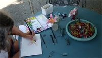
     A typical studio workspace during the weekend held participants' collections of small natural objects collected from the woods, snacks, notebooks, instructions on how to draw trees, and their works-in-progress. Here is Dewey Henderson painting a maple leaf which she later cut out and applied to her journal case.


    Gayle_sketches Sandy_table On the left, Gayle Waddle-Wilkes has drawn items on her table as small studies.

    On the right are Sandy's studies of poppy seed pods and a cedar branchlet. 


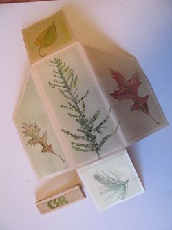
    Below, from left to right: Kay Lewis' journal case, Roxana Augusztiny's outdoor sketch, and Randi Kander's four completed journal pages.


    Kay_portfolio Roxana_landscape Randi-pages 

    Many students succeeded in sketching both small, natural objects and more complex outdoor scenery for the first time. Watercolor was added to pen drawings, bringing them to life, especially on the tea-dyed paper. 

    Riversketching Morning_sketchers


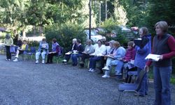
    On the left, retreat participants write journal entries after making small-scale sketches by the Wallace River. On the right, chilly sketchers take their places for a step-by-step tutorial on drawing buildings.

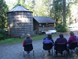
    Below, you see the buildings that were the subject of my drawing lesson. On the right is Randi Kander's sketch of the buildings. Capturing perspective, scale, and dimensionality were the goals of the session.

    Tank_shed Randi_buildings 

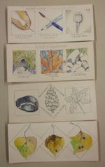
    Some students continued to work on their tea-dyed portfolios after they returned home. Below are some of the images from Claire Russell's completed pieces. To become comfortable and confident in your drawing skills, you must practice, and practice some more. Keep at it! You'll see steady improvements the more you do it. Some participants will be getting together at home to sketch together. Indeed, camaraderie & mutual commitment make practice more fun.

    Claire_pages

    IMG_0501_2

  • My inky jaunt into our American past began last month with the admiration of a boldly colored, berry-laden mystery plant in the garden of my son and daughter-in-law. As Amy and I were admiring this tall, magenta-tinged interloper, Eli went online to find out what it might be. Soon he had the information: it was a pokeweed, a significant plant in United States history. The Declaration of Independence was written with the fermented juice of the berries of this plant. Further, Civil War soldiers wrote letters home using this available ink. The plant is more common in the south and east than here in the northwest. The more information Eli relayed to us, the more intrigued we became. I asked myself: what calligrapher worth her ink wouldn't give this a try? Immediately, I harvested some berries and once back at home, I proceeded with the experiment, inspired by the historic significance of the plant also known as inkberry. Here's the way it went:

    Pokeberrycluster


    A ripening cluster of pokeweed berries. In the background, the valley in SW Washington where Eli and Amy have their small farm. 


    Pokeberrymortar 


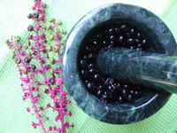
    First, I crushed the berries using a mortar and pestle. Next, I allowed the berries to sit in a glass bowl for two days in a warm spot so that they would begin to ferment.


    Pokeberrycheesecloth


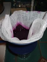
    Then, I poured the fermenting berries into a cheesecloth-lined coffee cone and pressed the juice through. To the juice I added a little bit of water. I heated the resulting "ink" in the microwave in order to discourage bacteria from growing. 


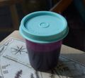
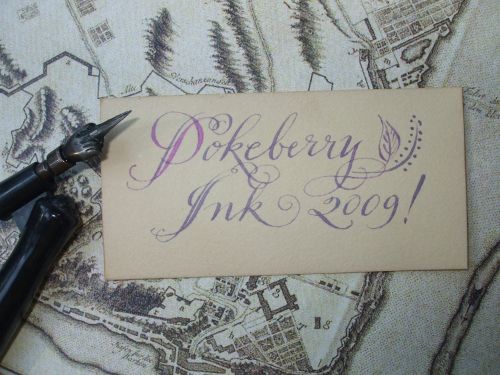
    Pokeberryink My two clusters of berries yielded about three tablespoons of ink. Below you see my handwritten sample using the historic ink recipe. The fluid wrote perfectly with the old-fashioned pointed steel nib shown in the photo. Currently, the sample is on my windowsill, exposed to light so that I can witness the probable fading of this very organic ink. Oh, one more thing: don't drink the ink. It's poisonous!


    Pokeberrywritcloseup


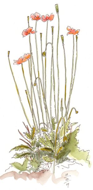
  • PoppiesSome of my very favorite plants have hitchhiked into my garden as seeds hidden away in the pots of other adoptees. Such is the case with this clump of graceful, generously-blooming poppies that has pleased my eye daily (especially as I eat dinner as they are in my line of sight from our greenhouse table) for months. I snip off the seedpods, and more hairy little buds are eagerly sent up to open into gloriously bright apricot-colored tissue blossoms.

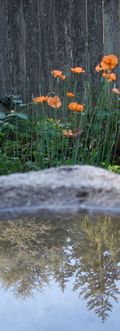
    After I did this drawing, which I've been wanting to do all summer long, I realized that part of the beauty of the poppies can be attributed to the fact that they are always seen against a weathered cedar fence. So, to be thorough about sharing my poppies with you, and doing justice to them, I have taken a photo of them against the fence. While I was doing so, I discovered the reflected evergreen trees in the birdbath. How arty!

    (tech notes: for the drawing I used a 000 Rapidograph and Winsor & Newton watercolors on Fabriano hot press paper.)
     

    Poppy and reflection


  • If the title of this post sounds idyllic, it was so intended. A second annual day devoted to painting Claire's lilies (after eating a potluck lunch to fuel us forward) happened last week on a blissful summer day. The next best thing to having been there is to see a few photos and read a few notes, so please be my guest and take them in! First, we insisted on seeing Claire's journal from a recent trip: Click on each image to see a larger view.

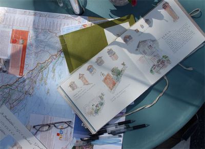
    Croatia  Claire Russell and her husband Travis took a 7 week trip to Croatia in the spring. Before our lunch, Molly Hashimoto and I listened raptly to Claire tell about their hundreds of miles of biking along the hilly roads of this long coastal nation. All along the way, Claire kept a journal that knocked our artists' socks off. She did studies of all kinds of difficult subjects: lamps on lamposts, stone towers, architecture of all kinds, landscapes, and street scenes. She is a true student of the travel journal by studying and trying new page layouts, new lettering techniques, and new bindings.

    SketchbookPile When I innocently asked Claire what books on artists' journaling she likes, citing the fact that my students have asked for recommendations,  I laughed heartily when she dashed into her house and emerged with a huge stack of books she has bought and studied! A second weighty stack was brought out after lunch! Now here's a serious student…and it shows.

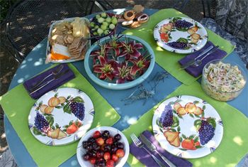
    LilyLunch 

    Yes, it tasted even better than it looked.
    Thank you Claire for setting the table so very beautifully. I can still feel the fresh-off-the-water breezes, too.


    ClairePainting  


    Here is Claire at the same table, after lunch, painting lilies. By the way, all the lilies grow in her garden, and they are currently at their peak.

    Lily postcardsm  


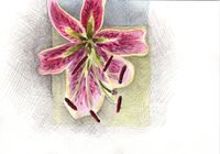
    Here is one of the two postcard-size drawings I did that afternoon. This one was drawn in pencil, watercolored, and then I picked up my pencil to idly hatch away while Claire and I chatted at the table (Molly had to leave after lunch). If there were other commitments I had that afternoon, they vanished from my mind. THANK YOU, CLAIRE.

  • To my students from the North Cascades Institute Art Retreat and all others who may be interested, I have created a page showing my Nature Journaling watercolor demonstrations (plus a few basic calligraphy & lettering tips) with brief explanations. To see the full page, click on the image below or locate the page in the Portfolio column to the left of this center column. Also, please scroll down to see my previous post!

    Molly Hashimoto taught the Landscape Watercolor group at the Retreat. To view the excellent posts on her class and their experiences, click on her name to go to her site.

    Mountain demos

    Click on this image to view more demos from the retreat.

  • Please Note: To read about my upcoming drawing course at NCI in June, 2010, please click here

    **************************************************************

    During the four days of teaching Nature Journaling at the North Cascades Institute Learning Center, my primary watercolor demonstrations were designed around painting the peaks and the trees of the region. The scale was kept small for our journaling purposes, so I presented a variety of techniques:

    Mountain demos 

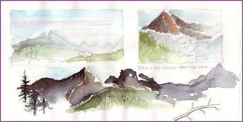
    Above, the top left image shows wet-in-wet watercolor washes over a pencil sketch as a base for a journal painting. To the right of this, another pencil sketch is enhanced with watercolor (coarse kosher salt added to Pyramid Peak) with added pencil shading. Stretched across the bottom is a panoramic pencil sketch made at dusk along the road to Diablo Dam. To the sketch I added darker values of paint. In class, I added gel pen hatching and crosshatching to give further texture and shading. Small scratches on Colonial Peak demonstrated removal of dried paint to create snowy crevices.

    Mountain demos 2

    Above on the left is a “pointilism” variation for adding graduated color and shading. Some students tried this in their journals, and it provided a calming, controllable painting technique. While doing the original pencil sketch, I had added the field notes to assist my memory later. These could be erased after painting. On the right, I experimented by spattering the pencil drawing with suggestive colors. Obviously this is not a technique for the perfectionist, but it is a liberating approach! Loose brushwork added to the foreground trees immediatelycreated the focal points.  

    Callig demos 

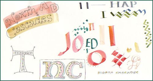
    As a calligrapher, I have enjoyed giving some general lettering tips to journaling students. This time, I sat down and demonstrated attributes of the Speedball C series pens, and showed the class how to do non-traditional lettering that would enhance journal pages. Two of the participants were left-handed, so the “ED” you see in the center is my attempt to control the pen with my left hand. I could sympathize with the challenge they face!

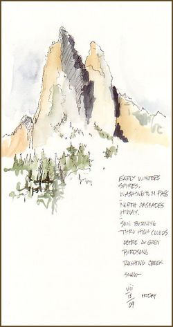
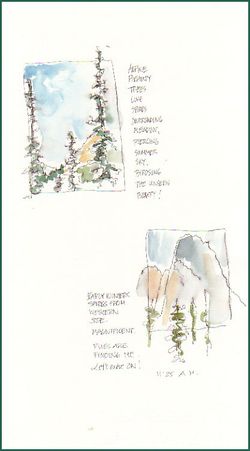
    Finally, below are sketches I made while we were on our excursion to Washington Pass. On the left I used my favorite UniBall Signo RT Gel pen, which is waterproof when dry, and on the right I tried a new, finer-tipped pen to see how it performed “in the field.” It wasn’t waterproof! But, for these sketches, a little bleeding didn’t detract.

    Spires sketch Journal sketches jc

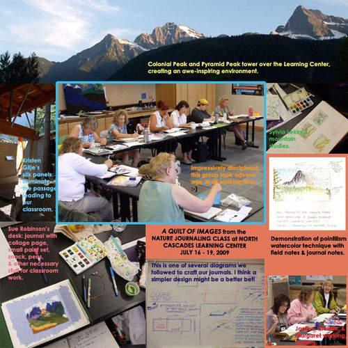
  • How best can I describe the experience of four days in the splendid environment of the North Cascades Institute, located amid the granite peaks and lakes of the North Cascades mountains? I've begun by creating two montages of images shown below. I have more photos and information to add, but will offer these for now. My exceptional group of 15 Nature Journaling students got right down to the task of making their own journals using smooth watercolor paper. The moment the books became functional, we were off to the forest for sketching exercises. The next day, we were up into the mountains for a sketching excursion. During non-classroom hours, students were working in their journals, with many of them having numerous pages filled by the time Sunday lunch came and it was time to leave our temporary home by Diablo Lake.  (Click to enlarge ~ the captions will be legible that way):

    Quilt2flat  

    One of the changes from the 2008 class's curriculum was the addition of a van excursion for the purpose of practicing plein air sketching. I wish I had taken more photos of the sublime views in our four locations! Thanks to Liz for sending me the photos of the wildflowers, especially. And thanks to NCI's Allen and Katie for cheerfully and safely driving us and catering to our plein air whims.

    Photoquilt1flat

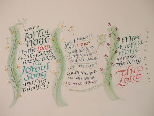
  • From time to time I'll still do a calligraphy commission when the assignment beckons. Earlier this month I accepted one that was to be given to a retiring church choir director (I've removed the dedication line from beneath the piece for the sake of privacy). The exuberant scripture and the request that the calligraphy not be on straight lines (how often does this happen?!) piqued my interest. Here's the finished work, with a few notes beneath it (click for a close-up view):
    Psalm4blogA The recipient's favorite color is green, she loves her garden, and she also loves instrumental as well as choral music. Plus, she is relatively young so I decided that a youthful, lively rendering of this Psalm might suit her well. I first made a pencil sketch which was presented to the client, and after a couple of minor adjustments were made, I proceeded to the final artwork. While not having to adhere to straight lines is fun, it does require careful plotting out of the spacing and the curvature of the lines. The central passage in Italic lettering could use improvement, but after weighing the pro's and con's of starting over, I decided to carry on. One of my favorite things about this work is the turquoise watercolor I used for the first time: cobalt teal blue. The final gold touches on the lettering and illustrations are dots of 23k gold leaf. I used hot press (smooth) Fabriano paper, and lightfast Winsor & Newton watercolors.

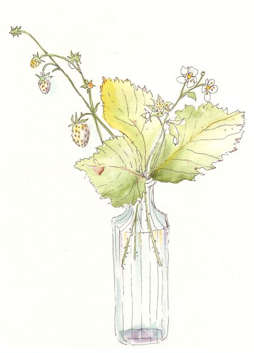
  • White strawberry
    Several years ago I was given a clump or two of some tiny strawberries. The story about them went something like this:

    During World War II, a U.S. pilot was shot down over the French countryside. He hid in the woods for weeks, surviving on wild plants. This white strawberry was one of those plants that helped him survive until he was rescued.

    I like this story, and have decided not to investigate it because every time I eat one of the berries, I think of the pilot and somehow I start to feel like a rescued survivor myself! The little clumps of berries are now happily acting as a groundcover in an area of our property that I call The Irish Garden. They are spreading among drought-tolerant ferns and columbines, and are now bearing their sweet and intensely flavored fruits. This morning I picked this little bouquet of them and drew them while sitting at my studio window, with the calls of songbirds drifting in. 'Tis sweet, the summertime.

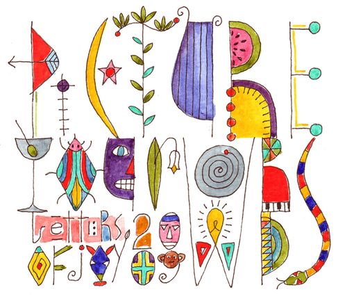
  • Yesterday at Letters of Joy, a calligraphy and paper arts conference sponsored by Write On Calligraphers of Edmonds, WA, I had 36 adventuresome students in two classes entitled Picture Your Words. The eager artists rose to the challenge of thinking differently about lettering and images brought together. They gamely followed a series of exercises I had prepared for them (if you are one of those students, know that I appreciate your hard work) with the help of a booklet I designed for the classes. On the cover of the booklet was the artwork shown below. It exemplifies the final exercise I gave them and was done with a fine black gel pen and Winsor and Newton watercolors. The original is 3" x 3.5". Can you read it? Here's to having fun with drawn letterforms and color. Try it!
    Frontispiecesmall