Herbal Get Well 5×7 Card, purple foil RW Emerson text on front. Inside: Rest, take care and take all the time you need to feel well again. $2.95, free shipping
![]()
Herbal Get Well 5×7 Card, purple foil RW Emerson text on front. Inside: Rest, take care and take all the time you need to feel well again. $2.95, free shipping
![]()
Jocelyn Curry Lettering and Illustration
Since 1989 I have been completing a wide range of assignments for local, regional, national and international companies. Creating calligraphic titling for Eddie Bauer catalogues in the 1980’s launched me into the realm of commercial work after my training in the traditional lettering arts was complete. Lettering for package design, wine labels, corporate identity, seasonal campaigns and corporate publications has been ongoing in my studio. I began working as an illustrator and calligrapher for the greeting card industry in 1998.
Beginning in 2011, I have been designing hand-drawn maps for trails, specific properties, and publications. Recently I completed a series of complex maps and schematic illustrations for Skagit County PUD. These are now installed in their Judy Reservoir Water Treatment Plant in Washington State. Other clients include Skagit Land Trust and the North Cascades National Park. In 2016 Yale University Press will publish a book illustrated with four maps hand-drawn by me.
Now, in 2018, I have decided to officially retire. I am working on my final commission which will be completed later this spring. I’ll be leaving my website intact, as is, because it is my wish to have my work and the work of my students available for viewing until I decide otherwise.
Thanks so much for your interest.
Please note that all of my work posted on the pages of this website is under copyright by me and may only be used or published with my permission. Fees for usage would apply in most cases, and should my artwork be used without authorization, litigation would ensue. Please email me with inquiries.
Jocelyn Curry
Over the course of a career, lettering artists amass an entire library of files both digital and the paper kind. A while back I worked on a charity campaign where the slogan was Love Thy Neighbor. Below is one of the variations that was not selected for the final rendering, but as I feel it has calligraphic merit, I've taken it out of its file folder and now send it into cyberspace:
I made this drawing during my Tuesday morning drawing
group. We each drew it, from our seated
perspectives. Later, in the studio, I passed a pleasant hour as I added
colored pencil to the graphite sketch. How many colors could I add and
still have it look like zinc? Lots. Click the pic for a larger view.
After 18 months of incorporating projects, assignments, musings and travel entries on my www.jocelyncurry.com site, I've made a decision: I'm going to designate that site as "professional" and this one "a blend of everything else." A digital divorce of sorts. This way, prospective clients won't wonder why a lettering artist/illustrator is featuring fleece hats on her site. I will post info about my teaching on both sites. I feel that teaching is some of the most important work I'm now doing and I want to publicize it as much as possible.
In addition to posting "everything else" here, I'll be doing something new: selling (at low prices) my commercially published cards. curry powder cards currently features traditional, seasonal cards accumulated during my ten years of designing for Papyrus (previously known as Marcel Schurman). I've also put together a page for two RSVP year round cards (Get Well & Sympathy). As seasons and holidays pass, the inventory in curry powder cards will reflect this passage. Soon, I'll also be offering cards published by me, featuring my artwork that people have told me they like. PayPal buttons are placed by each listing for your clicking convenience. View the sidebar to the left for curry powder cards, categorized.
My favorite hobbybusiness, Soft Shelter Hats (SSH), will also always be featured in the sidebar. Click on any hat to check it out in my Etsy shop. Read about Christine under "Profile" there, too ~ she's my hat partner in the shop.
Thanks for reading curry powder's very first post!
What lies behind us and what lies before us are tiny matters compared to what lies within us.
This quotation by R.W. Emerson was given to me as a starting point for a graduation card design assignment. Immediately, the concept of using an acorn and an oak tree came to me. My art directors at RSVP (a division of Sellers Publishing) liked the imagery idea. My job was to create the two main images and the calligraphy for all the text. To the left is the first sketch I sent in, prior to realizing that the Emerson text was to be placed on the card front. Click on each image to enlarge.
On the left is the photocopy image I started with for the oak tree. I wanted to create a silhouette version for a background, which I achieved by working with the scan in PhotoShop.
For the illustration on the right, working from a real acorn, I used a pointed pen with ink and a watercolor wash. When the card was printed, the border and accents on the acorn were foil stamped.
To the left, this composite of the card shows the final placement of the elements. The calligraphy is FPO, with the final lettering submitted as a separate hi res file. The printed version of the card has the tree silhouette in a satin foil.
To the right, a tip-in liner for the card (it will fold in the center) features a ghosted image of the full oak tree. A pen, ink and watercolor border of acorns travels down the right side. The card has just been printed. I'll post a photo of it when I receive samples.
January invites Seattle area gardeners to take a hiatus from tending their plots. Sodden stocks lie on the ground along with moldy leaves that fell in autumn. It rains a lot, or it's awfully gray. Given the dreary palette, I observe from my studio window and keep my eye on the birds' coming and going. Every year, I forget to anticipate the hellebores that send up their vigorous buds in this non-gardening month! Today, in search of something to draw and feature for a post, I considered a clump of lime green lichen. Then, I remembered the purple hellebore in the deep shade of the cedar fence. Sure enough, its buds are emerging from the decay of last year's foliage. As the day's light waned, I did a quick sketch with a pointed pen and India ink. Inside, I added watercolor. Here they are. Click here to learn more about the genus helleborus.
I've recently been working on a custom seahorse-motif wedding invitation project involving illustration, design, and production of handmade pockets for the pieces. It's been so much fun! Here is a photo of the completed wedding invitation suite with its seahorse images applied in different ways. Information about the materials I used are described below the photo. I've kept the resolution low and altered the address so as to protect the couple's privacy. All pieces tucked into the pocket except for the return address label which was applied to the back of the 5"x7" envelope.
Colored papers used are Stardream Flame and Mars (red). The cream paper is Classic Crest Cover, Classic Cream. All papers were bought at Paper Zone here in Seattle (this west coast company is a fav!). The small Mars envelopes were ordered from The Envelope Mall. The light-colored return address labels were printed on Stardream Opal die-cut labels (available from Envelopper Inc.) I recommend both of these online companies for their product lines and fast service. The dyed strip of paper across the hand-cut pocket is a handmade paper purchased at the University Bookstore in Seattle.
All pieces were printed on my workhorse color laser printer, a Lexmark C522, and trimmed with my Dahle rotary trimmer. These along with my MacBookPro and Canon scanner round out my design and production team!
Brought together by the desire to practice sketching, two friends and I have gathered over tea one morning a week during these later autumn months. We've drawn objects in my greenhouse, objects placed on the table beside our teacups and muffins, scenery outside the window, and items in the interiors of our homes. Whatever presented itself, in other words. Last week I selected as my subject an endearing symbol of Yuletide in the form of a small woollen, fur-trimmed elfin doll: Father Christmas. He was perched upon a wooden box on my friend's buffet. Once back in my studio, I completed the sketch by making a frame of lettering consisting of international names for the familiar figure. Digitally colored in PhotoShop and placed before you on your monitor, he has now hopped from the buffet onto the internet. Good Yuletide Cheer to One and All!
Autumn arrives early in the province of Quebec, Canada. As we drove along the mighty St. Lawrence river on our way to Quebec City after having landed in Montreal the night before, the sight of the changing leaves nudged a quiet shift to occur within me. Rather than the melancholy I often feel at the outset of Autumn, I felt a keen, fresh awareness of how I would embrace the season. We spent nine days enthralled in Quebec City and Montreal; I kept a sketchbook of my experiences. Traveling with friends, we made a harmonious foursome. A month has passed since we returned from Quebec, and Autumn still has me curiously intoxicated here in Seattle. I want to read in the early mornings (this old habit somehow had been pushed out by work & exercise routines), knit, sew, make soup, plant winter-hardy violas and chard in the garden, draw, paint and write letters… I abruptly went from wanderluster to homebody, inspired and fulfilled by the earthy beauty of the places we explored in Quebec. To every thing there is a season.
Here are some entries from my sketchbook. Please click on any image for a larger view. Sorry for the omission of proper French accents in this post. I don't seem to have a bilingual font readily available!
The restored stone houses of Old Quebec beg to be sketched.
This little view was in Le Quartier Petit-Champlain.
Cafe au lait was charmingly served in large "boules."
A trip to the Musee des Beaux Arts was marvelous. One positive/negative wood sculpture inspired me to sketch it.
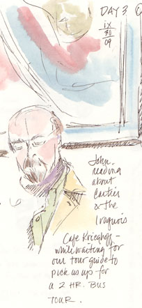
Travel companion John reads over breakfast.
I am always interested in viewing exhibits of the cultures of the native people. In Quebec, the First Nations are referred to as the Amerindians. I sketched this page at the excellent Musee de la civilisation in Quebec City.
The ex-voto hearts in the La Chapelle de Notre Dame de Bon Secours in Le-Vieux-Montreal contained tiny handwritten scrolls (prayers, expressions of gratitude, etc.) and were then hung high on the chapel walls.
Thank you for traveling along with me. Bonne journee!
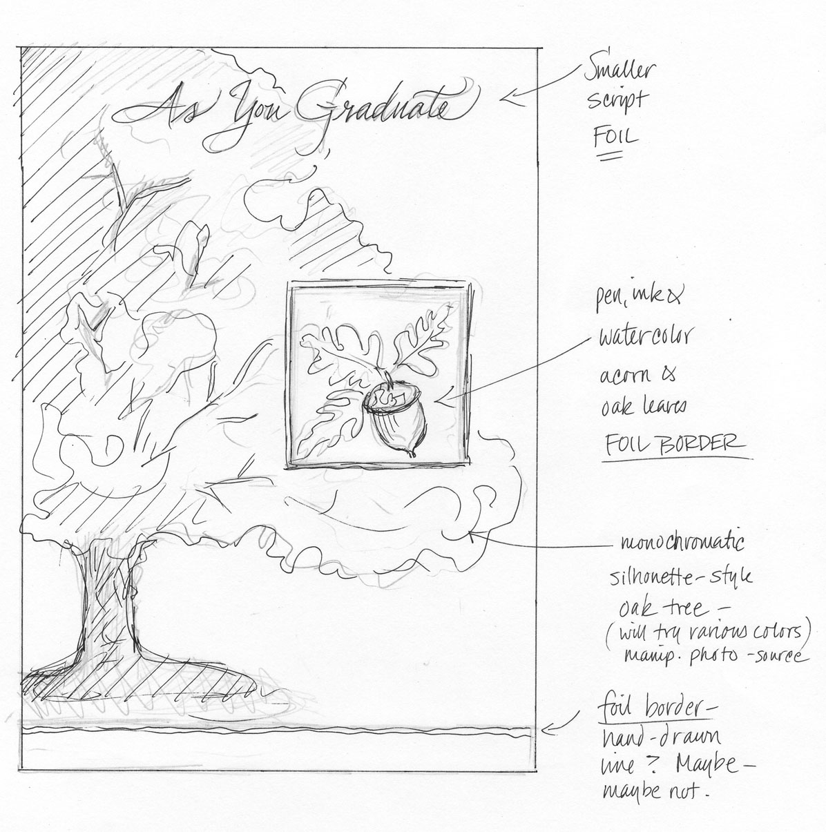