Jocelyn Curry

Art & Joie de Vivre

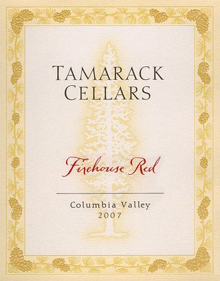
  • FirehouseRed2007

    Some clients become career-long favorites. Tamarack Cellars Winery in Walla Walla is one such favorite of mine. Several years ago I was contacted by Hornall Anderson Design Works in Seattle to do the delicate, antique-ish script for the wine varieties being produced by Tamarack. Ron Coleman, owner, has since regularly assigned me to do the successive names for all the labels of his highly acclaimed (and tastefully labeled) wines. Firehouse Red is a favorite blend. Click on the label to visit their website, read about their wines, and sense the integrity and personal warmth with which Ron runs his business.

    A similar version of this handwriting style was used in this brochure published by Safeco Insurance Co. of Seattle. The original lettering was greatly enlarged to boldly state musical terms and city names featured in their publication.
    Safeco brochure

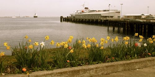
  • Coho The Black Ball ferry Coho waits at the end of the dock. A bench from which I took this photo provided our picnic spot while we waited to board.

    I'd always wanted to take the ferry from Port Angeles (on the north side of the Washington State Olympic Peninsula) to Victoria, BC. The visit by a Canadian friend last week allowed for this excursion to finally take place. After a two-day stay in Seattle, we went across to visit her parents who live in Victoria. What a perfect mini-vacation, to take a 90 minute ride on the seaworthy Coho and spend a couple of spring days in unique Victoria!

    While chugging across the channel, I did a quick sketch of a bank of vintage chairs in the passenger section of the ship. A cozy booth table by the window allowed my friend and me a chance to talk about our preferred art materials for our respective small travel journals. Hers: watercolor pencils. Mine: gel pen and traditional watercolors.

    Green chairs

  • DSCF4860

    The handsome, overall package design for SBC's ice cream line was created by Hornall Anderson Design Works in Seattle. I was hired to do the flavor names.

    If you were to look at these cartons of ice cream, would you be able to tell that the lettering for the flavors was done all by hand? Probably not, as it has a polished, typographic appearance. The art director for this project wanted something more than straight typography for the flavor names on these pint cartons. Small flourishes on the letters, spacing adjustments, and just the right thick and thin balance on each letter created the subtle quality desired to evoke the message that this was a premium grade ice cream.

    I began by drawing the letters in pencil, shaping them and finding the right weight. I then inked in the letters, working on them in a size about twice the size of the printed image on the cartons. The most fun part of this assignment was buying one of each of the flavors after they were on the market, and having an ice cream feast with my famiily.

    Seattle's Best Coffee is now a subsidiary of Starbucks, Inc. The ice cream is now packaged under the Starbucks brand. One can assume that the ice cream is still outstanding!

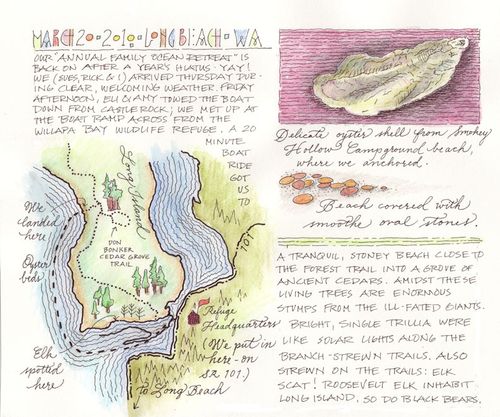
  • Living in the Pacific Northwest offers unending opportunities to see nature's marvels. Some of these can only be had if one has a boat! Marvelously, our son and his wife Amy ended up being extraordinary outdoorspeople ~ with a boat. Lucky us. I've always wanted to see the grove of ancient Western Red Cedars on Long Island, part of the Willapa National Wildlife Refuge at the Washington Pacific coast. Here's a pictorial account of our excursion last Friday (scroll down to see photographs, click to enlarge each image):

    WillapaJournalsm

    JocAmyboat BeachboatTop, above: a journal page I created about our trip.

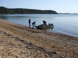
    Left: Amy and I traveled in the bow of the boat.

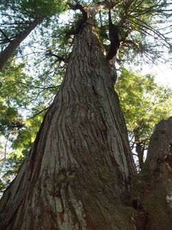
    Right: We anchored the boat at the beach by the Smoky Hollow campground at Long Island, accessible only by boat. We located the trail through dense forest, and followed the rustic signs to the Don Bonker Cedar Grove. Some of the magnificent giants are nearly 1000 years old. The trails through thick understory growth were punctuated by luminous trillium flowers. A rare and timeless experience, this excursion inspired us all.

    OldCedar Trillium

  • Continuing with the theme of brush-rendered animal illustrations, here is a trio of butterflies. To see what design project they were a part of, please click on the image to be taken to that page. These butterflies are available for licensing!

    3butterflies

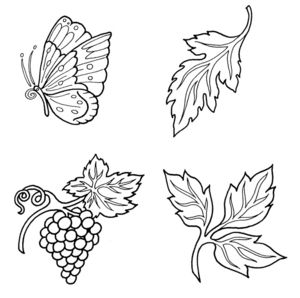
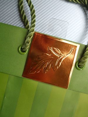
  • As an illustrator, I have learned a lot about commercial printing and production. To show how a simple illustration serves as a pattern for a fancy die, here are four images I created for embossed die imprints for gift bags. The brush-rendered butterflies were options given for a style choice. Ultimately, a simple line-drawn style was chosen. Here are the four final ink drawings that I completed, plus a photo of one of the final gift bag embellishments for which they were used. The company: Marcel Schurman, now Papyrus. These illustrations are also now available for licensing. Email me for this information.

    DieQuartet

    A heavier inkline indicates the deepest, primary outline of the die. The finer inkline indicates the shallower level of the design. Note on the photograph below how the single leaf motif translated to the two-level die that was created to emboss the copper.

    Bagpic
     

  • A swan taking off from a lake or a pond is not as endearing an image as one romantically swimming calmly across the water. Nevertheless, this is what was asked of me: to create an illustration of the splashingly awkward and chaotic swan at liftoff. Below are four of the sketches I submitted to the client after doing my research:

    Swan1 Swan2 1


    Considerations were: how much detail should be included in the wings, and in the depiction of the water being churned and splashed? Should the swan be made to look more graceful than it realistically does when accelerating in the water? In the end, a classic, poised swimming swan was chosen over the active version. Why? It was much easier to incorporate with calligraphy and type in the final logo. And, there was no ambiguity as to what bird it was. There's no mistaking a swimming swan.

    Swan5
         Swan2


  • For the past three days, Millersylvania State Park offered a few friends and myself a tranquil refuge. Our cottage was situated at the edge of Deep Lake; surrounding us were the towering trees, wetlands, old orchards and a web of trails around and throughout the park features. Extending out into the lake was a dock with benches, so I took a few quiet minutes to do the following sketch, to which I later added watercolor.

    DeepLakecp Deep Lake, Millersylvania State Park, ink & watercolor, 3.5"x11"

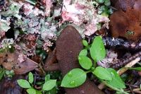
    Newt During one of our walks on the soft forest paths, we nearly stepped on a little woodland amphibian silently crossing the path under foot (click on the photo for a close-up view). Upon my arrival home, I found out that it is a Taricha granulosa, a rough-skinned newt, one of the most poisonous animals alive. No wonder it is not considered endangered! Eating one has dire and deadly consequences.

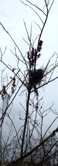
    Nest

    Rising delicately above the wetland, this nest was spotted from the trail by another in our small party of walkers. The network of bare branches was evidence that in spite of the early signs of spring here in western Washington, winter is still with us.

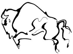
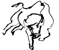
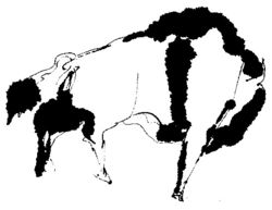
  • A logo design assignment I contracted to do involved lettering and images for a new gift shop entitled Buffalo's. I enjoyed exploring the contours and dynamic energy of the buffalo (aka the American Bison). Here are a few of the illustrations I created for the client. Very little retouching has been done to preserve the raw, active character of the lines:

    Eyedropper1 Sketchsm


    Left: eyedropper and sumi-e ink. Right, felt tip pen.

                                                                        Eyedropper2

    Soft1  

    Left: eyedropper and sumi-e ink on absorbant paper.

    Right: eyedropper and sumi-e ink.


  • We left the city for Eli and Amy's farm, driving the 2.5 hours south of Seattle in bright sunshine. Work is ongoing in the farmhouse as well as in the farmyard! We've had a productive time of it this weekend, with my painting bedroom door and window mouldings cut and nailed in place by Rick, and Amy doing everything from the first meadow mowing outside to setting traps in the vicinity of the chicken coop. Varmints are eating the eggs…

    I have decided that the term hissy fit derives from goose habits. The two full-grown Toulouse geese here have become nasty fellows, hissing at me as they did during the full hour I spent cleaning out the strawberry bed yesterday! Here's one of the pix; the goose on the left tried to snatch my camera right through the fencing before this photo was taken. Amy and I braved their beaks when we walked across their territory in order to see the beautiful nest the ducks had constructed under the brush pile. We needed switches to defend ourselves from the geese' excellent beak aim. Intruders beware!

    Geese LakeSac 

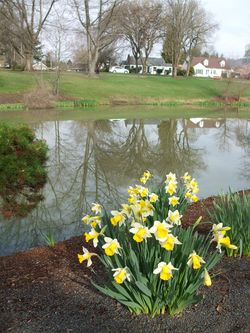
    When we are at the farm or in Longview for other reasons, one of my favorite activities is to walk or jog around Lake Sacajawea, one of Longview's prides. This morning I took this shot from the Japanese garden on an island in the lake. Beautifully maintained all year long, the lake is especially lovely in the spring.