Apparently, 1910 was a good year for the greeting card industry.
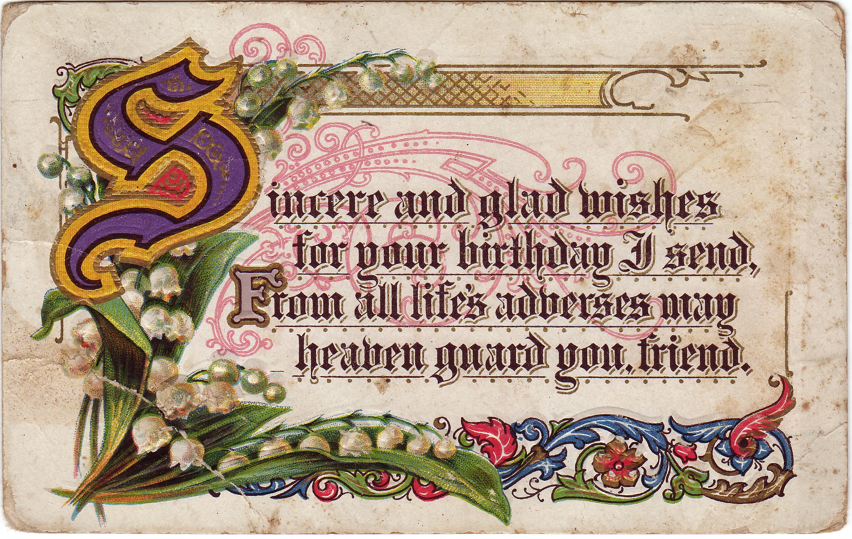
I found this elaborate postcard last month in an astoundingly cluttered antique mall in Columbia, SC. When one designs a greeting card, one of the major considerations is the list of processes the final design will require. Budget determines whether the card will be printed simply with flat colored ink or be put through the presses several times to create a multi-textured and colored product.
On this card: several flat spot colors, 4-color litho, complex embossing, gold ink and possibly a letterpress pass for some elements. I would guess that a lettering artist did the gothic calligraphy, an illustrator the lilies of the valley, and an illuminator the traditional acanthus leaf borders and versal letter S. Putting all this together for the printer was no small design feat, and the final price tag must have been high for this little card. It's a mini-manuscript!
When I first saw the card, I took note of the red, swirling motifs behind the gothic sentiment. Although the trend appears to be fading, this is the same graphic device that has become so popular in current advertising design: layered graphics with ornate swirls moving behind the message. One hundred years ago, designers were already discovering the appeal of the same device.


