Announcement! Are you interested in this course? I will be teaching it again at the North Cascades Institute Learning Center on Diablo Lake from Sept. 6-9, 2012. To read more or to register, please click here.
~~~~~~~~~~~~~~~~~~~~~~~~~~~~~~~~~~~~~~~~~~~~~~~~~~~~~~~~~~~~~~
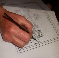
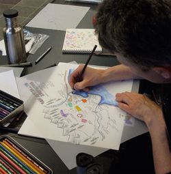
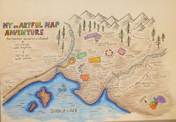
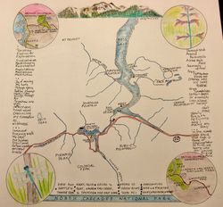
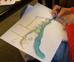
In this 15 hour course conducted over three days, eighteen participants each created at least one map, and several created more than one. Held at the Environmental Learning Center of the North Cascades Institute, the location could not be better for such a course. The curriculum left open just what was to be mapped by each student. Antique map images plus existing basic maps of the campus and the surrounding area provided visual aid, and a booklet I designed provided map layout and structure ideas. Students received India ink, a dip pen for drawing, a Micron Pigma, and various papers. The rest was up to their observations, reflections, inspiration, aesthetic preferences, and what skills they already possessed. I gave tips on icon drawing, lettering, page design and color but this was not specifically an art instruction class. Navigating through all of the considerations and putting them together in the form of a map was a very complex mental journey for all 18. Here are some photos that document the participants’ successful work (click to enlarge images):

 Left: The “before” shot of our classroom. On the right, later the same day, the class went for a trail walk. This one hour exploration served to inspire many in the group to make maps based on sightings and features that they were able to incorporate into their maps. Others opted to create maps with personal themes, such as maps of their favorite walks where they currently live, or of their childhood home towns. The majority detailed the immediate or regional geography, flora, and fauna.


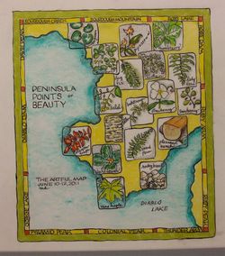
Above: Entirely drawn and labeled with the fine pointed mapping pen, Mary Heath’s map of the small peninsula on the campus depicts many of its native plants (plus its massive log bench) on frosted mylar. Linear drawing and stippling (tiny dots) in India ink work perfectly with the vibrantly colored pencil work. A “neatline” or map border contains names of surrounding mountains and other regional places.
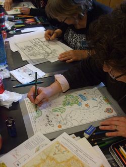
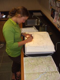
 Left: Showing the concentration that was typical in the classroom, Deb Martin and Debra Brodie both made hometown maps with the help of GoogleMaps images (modern technology and office help came in handy for several of the students). Deb’s was of her childhood home in Montana, and Debra’s was of her current home on Fidalgo Island. Debra signed up for the class when she read that one not need to have drawing skills to make a map.

Right: Working on smaller paper, Catherine Carter made several maps, trying different styles from traditional to “meta” maps using shapes, color, bold words, and paths to map places and experiences.
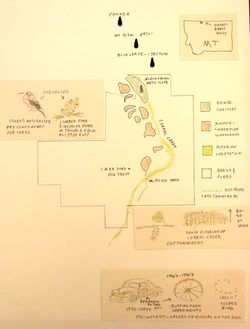
 Left: Mark Oswood used many of his own sketches (which were better than he thought they were) to illustrate his map of the deeded property of his grandparents’ farm in the Highline of Montana. He created a legend showing the varied concentrations of botanical species.

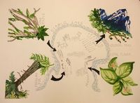
Right: Barbara and Jack Harris collaborated on a map of the peninsula. From the trail, one sees staggering peaks, tiny wildflowers, and numerous tree species. Here, Barbara’s watercolors show these while Jack’s fine pen drawings provide the peninsula interior in counterpoint. Their map is unique and alive, and shows the immediacy of their shared outdoor experiences.

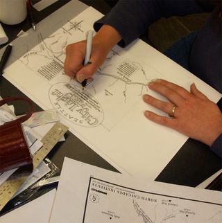
 Above: NCI employee and class assistant Katie Roloson gives the group a talk about the three dams, one of which we were standing on (Diablo Dam). Right: This talk inspired Katherine Malmsten to research and map the dams, including information on the map. This shows her inking in her map elements on the frosted mylar.

Left: Katherine’s finished map. Her love of maps and her lettering skills served her well.
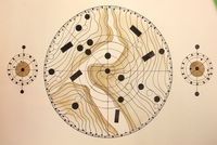
 Left: The concept of map lends itself to abstract interpretation, which is how Nancy Bonnema approached the design challenge. Using topographic images of the bottom of Diablo Lake, formerly a rocky gorge before the dam created the lake, she designed her elegant maps using circular forms, inked gemetric shapes, and soft walnut ink tones.
 Left: Sue Woehrlin working on a personalized map of the ELC area on frosted mylar, including
  journal
notes about her experiences there. Bright colors and iconic images give her map a fun, light character. Her wayward “compass rose” in the lower right breaks all historic map graphic traditions. Right: Sue’s finished map.

 Sisters Suzy and Wendy Harris worked in two contrasting styles. Left: Suzy’s map is a personal record of her trail walk around the ELC, with sketches of notable flora, fauna and structures. She used this time to work on her sketching skills which are a part of her existing journal work. Right: Wendy designed a complex map commemorating a journey she and her partner took while visiting the North Cascades on another trip. Her borders and corner insets give us lots of information about that trip while serving as a beautiful frame for the central map.

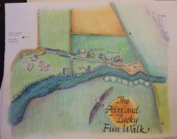
 Left: Michele Liburdy begins coloring her map of the route for walking her dogs in Skagit County. Right: The finished map, with a beautiful color scheme and evocative bird’s eye view perspective of her neighborhood. She will make another version of this map with more text notes about the encounters on a typical day’s walk.


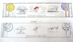
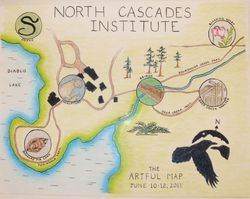
Left: Suzie Beringer’s linear map of one day’s sightings gave her the opportunity to draw delicately with the mapping pen and India ink. When I receive a better photo of her work, I’ll post it here! Right: Barb Murphy’s illustrated map features a series of images of plants, animals and structures sighted along the trails at the ELC. She colored the border of the landmass and the shoreline in a manner similar to an antique map tradition. Her “compass rose” utilizes the Institute’s logo.
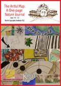
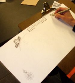
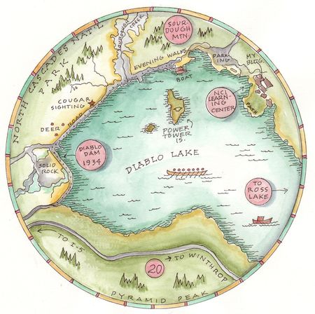
Below: Karen Kant perseveres with the long and detailed process of rendering map illustrations using the traditional pen stippling technique so popular with botanical illustrators. Karen is using a brown Micron Pigma on Arches hot press watercolor paper. Note that the North Wind on the left side is the one that is blowing down over the other map snippets I used to created the map montage above, at the top of this review. Her map will eventually be one where an around-the-world trip she took will be featured. The continents are not yet inked in in this photo.

 Right: Katie Roloson finally found time to work on her map of all the hikes and climbs she has taken in the North Cascades. She incorporated fun lettering as a title, and will be inking in her map with a Rapidograph technical pen and India ink.
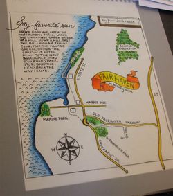
Below: Jen Martin’s crisp, colorful map (not yet complete in this photo) depicts her favorite running route in Fairhaven, near Bellingham, WA. She ornamented her capital letter M with an antique-style calligraphic letter commonly found on 16th c. maps.

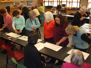
Below: Watercolor students from the concurrently running landscape watercolor class (taught by Molly Hashimoto) visited the mappers’ classroom, as we did theirs, at the end of the workshop on June 12.
Excellent work, everyone!

 Announcement! Are you interested in this course? I will be teaching it again at the North Cascades Institute Learning Center on Diablo Lake from Sept. 6-9, 2012. To read more or to register, please click here.