Jocelyn Curry

Art & Joie de Vivre

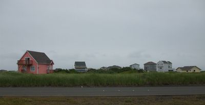
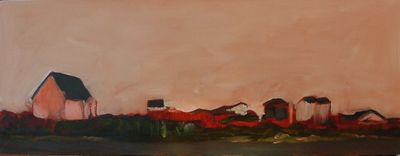
  • Cup 2Between daily life tasks, time with family, freelance work and my occasional teaching, I don't seem to find a lot of time to simply do artwork that has no "purpose." There are some subjects that often inspire me to paint in oils, to lay down color and create atmosphere with rich paint for the pleasure and challenge of it. Landscapes, primarily, inspire these feelings. Not that I've done any! But I have wanted to try my hand at them. So since my last Over Coffee, I did just that. In this case, I used a photo I took 7 months ago at Ocean Shores, WA as my subject matter. When I took the photo, it was with a future oil painting in mind.

    Below are four photos showing stages of the painting. Once I did a quick tonal study in burnt sienna, I started blocking in the dark colors of paint over the tonal underpainting, followed by the application of some lighter colors:
    DSCF0073Above, I had applied a light coat of titanium white over the sky. Below, the painting is further developed by my working on the buildings other than the large pink house. I applied an overall coat of gray over the sky.
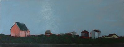
    DSCF0076The blue-gray was too blue for the classic, overcast-gray sky, so below you can see the change: another coat of paint over the sky! Problem: paint layers were, ahem, starting to get clumpy. Even with oils, there's a limit to over-painting areas, I am learning.
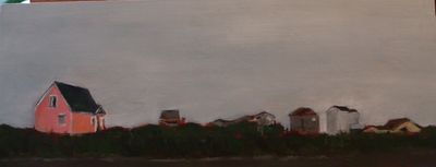
    DSCF0087In the above photo, the dense beach grass is in the foreground (photos were taken without flash, in low-light conditions), and I continued to work on all the buildings.
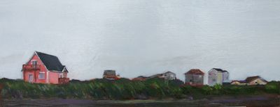
    DSCF0095
    This is the finished painting. It was only when I took the painting into the brighter greenhouse that I saw how 'textured' the sky had become! Ah well. I enjoyed delving into my paintbox again, and as this is the first landscape-with-buildings I've ever painted in oil, I feel that I learned plenty. My favorite part of the painting? The house to the far right!

    DSCF0095

    Below: the photo I worked from.
    DSCF8960_2


  •  

    Cup 6

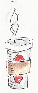
    Espresso in Québec City


    The thermometer read 25 degrees when I came downstairs this morning. My first thought was for my chickens, whose water would no doubt be frozen. In quick succession, I thought of the neighbors' cat (I'm feeding her this weekend), and then the hummingbirds. The feeder attached to my studio window would surely have frozen syrup this day, in spite of the sugar content.

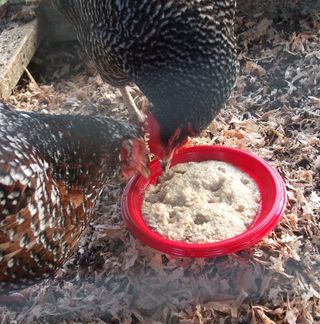
    I made oatmeal for the chickens, grabbed the neighbors' key so I could go feed their cat (indoor/outdoor kitty), and prepared a watering can of warm water to pour over the hummingbird feeder. As I attended to the needs of the critters, I felt like a suburban farmer. For the fun of it, I picked up my camera so I could document my farm chores and record them for this issue of Over Coffee:


    DSCF0068

    Bess and Vita judiciously pluck the sunflower seeds and raisins out of their plate of warm oatmeal. Cinnamon, at the bottom of the pecking order, kept her distance but did manage to get some, too.
    DSCF0069

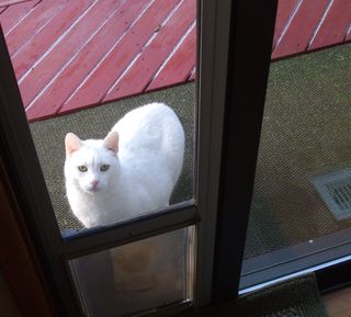
    Here, pure white Georgia has scooted through the cat door at hearing me enter her house. She is waiting for me to leave so she can have her morning meal I left for her in the kitchen.

    And then, when I returned to my studio to do some computer tasks, I turned to glance at the hummingbird feeder and this is what I saw:


    DSCN0571

    Hummingbirds visit this feeder during January and early February, only. I don't know why they do not come earlier, nor later. Perhaps my feeder thaws in the January sun, and the birds know this. For me, their visits are very dear. Often, I am sitting but a foot away from them, here on the other side of the window, and they seem unaware of my presence. This was taken from across the room, with a telephoto lens. Last night, at dusk, was the first time I saw a hummingbird approach the feeder since I put it up 10 days ago. The news is apparently out!


  •  

    Cup 5

    Coffee at the Lighthouse Beach on Sanibel Island, Florida

    How often do our field trips actually take us into a field? As I was thinking of what to title this Over Coffee, the simple congruency of this term – and what today's topic is – quietly clicked in my mind.

    Yesterday I attended a two-hour class on the renowned raptors of Skagit Valley at the Padilla Bay Estuarine Research Reserve followed by a field trip to see the magnificent raptors themselves. I had everything to learn about these birds of prey, so instructor Bud Anderson's 30 years of teaching this class (!) certainly sufficed. After a brief introduction to the topic, Bud startled us by lifting up from behind the podium a restrained, juvenile Red-Tailed Hawk. He had trapped her on his way to class, fitted her with a leather hood and an "abba," a straight-jacket of sorts used to secure a bird's wings to still it for leg banding or scientific observation. It was a rare opportunity, to view a wild bird of prey up close. Bud and his assistants banded her, weighed her, recorded the data, and then the class went outside with him to release the bird. Later, while in the field, we may have seen her soaring and hunting.

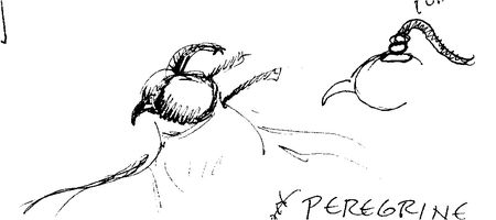
    Hawk sketch

    The rapid flow of information given in class didn't allow me to sketch much, but I did capture a little image of the classic leather hood used to calm falcons and hawks while they are being held. The little gladiator-type topknot caught my fancy.


    DSCN0562

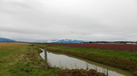
    The Skagit fields in winter have a beauty all their own. Their colors set off by the typically gray skies, the reds, golds and greens inspire me to paint. You cannot see it in this photo, but the one Short-Eared Owl we saw is perched on a short pole in the distance.

    Many of us here in our spectacular NW corner of the U.S. know the Skagit
    Valley for the annual Tulip Festival. Fewer of us brave the harsh
    elements of January and February to go there to view the raptors. The
    discomfort is worth it. With each stop our group made, along the side of
    the roads at the edge of the farm fields, we were treated to viewing, with our bare eyes, our binoculars, and scopes, the perching
    and actively hunting raptors. We saw numerous American Bald Eagles, both
    juvenile and adult, many Red-Tailed Hawks, Rough-Legged Hawks, one
    Peregrine Falcon (a thrill), a Short-eared Owl, Northern Harriers, and
    an uncommon dark morph Harlan Hawk. An increasing wind grew colder and more fierce; Bud told us that soon the birds of prey themselves would stop hunting and seek shelter, so we went our separate ways at about 1 PM, our raptor immersion experience complete.


    DSCN0565

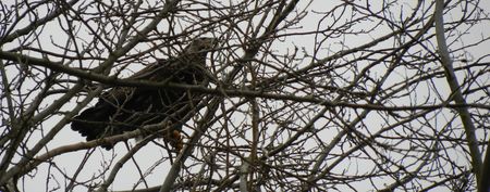
    At our last stop, at the "West 90" turn, where there is a well-used parking area for hunters and birdwatchers, I photographed a juvenile Bald Eagle.

    I drove home alone after this memorable morning spent with an expert and other students keen to learn about this part of our natural world. What wonders are ours for the seeing, and for the learning. At a rest stop along I-5, I called Rick to see if he had left the espresso machine set up, as I would be home earlier than planned due to the chilling winds. Yes, he said. I warmed up over my latté shortly thereafter, feeling the glow of fresh knowledge and fresh air.


  •  

    Cup 1

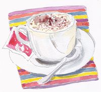
    Cappuccino, Venice, Italy

    Dear Reader,

    I have coffee at two times most days. The first cup is sipped shortly after I get up. The second is usually in the form of a beautiful latté brewed later in the day by my own personal barista: my husband Rick. Over Coffee, thoughts written while drinking either the first or second cup, will be a weekly feature here on Curry Powder. A drawing of a coffee cup taken from one of my travel journals will accompany each post.

    I've never been one to make New Year's resolutions. The concept doesn't have a lot of pull for me. That's why I find it curious that now that I face the end of 2012 and the beginning of 2013, I am feeling philosophical about self-betterment.

    First, let me say what inspired me to begin this new series, Over Coffee. Last week, Rick told me that two people in his circle regularly looked at my sites and wrote to him that they were disappointed that I have slowed down my posts to about one per month. This struck me. This moved me to want to post more often. I don't specifically know what these people would like to see or read. Art? My musings? Travelogues? Chicken stories? I won't ask them, but I will oblige their interest in my posts by posting more often, and gratefully so. To have my online contributions valued, and anticipated, is a gift and a reward.

    Let me step back yet another week. While working on a project here in my studio, a news review of 2012 was being broadcast on TV. When the portion of the review started playing that featured the notable people who have died in 2012, I stopped working and watched. A stream of performers, artists, news people, politicians and athletes flowed by in a moving memorial. I was struck. I was moved by the evidence of each one's dedication to their life's work. They excelled, they contributed, they entertained; they enriched and bettered the lives of us who co-lived on the planet with them. It takes a lot of work to excel at anything. To make life better for others is a worthy goal for anyone in any vocation. 

    As I approach January 1, 2013, I feel inspired. Not to keep resolutions, but to be mindful of excellence in what I do. In everything I do. It was inspiring to me that my posts meant something to two people who are not directly in my circle of friends and family. This means that my posts may mean something to others, too. Unbeknownst to me, they might better someone's life. I will proceed on this presumption. In my rôles as mother, wife, and grandmother, I want to do the very lovingly best I can. As a teacher, I will bring to the job all that I can to meet the needs of each student. As an artist, I will work hard, and I will be innovative. Once, I read that one of the supreme obligations an artist holds is to generously put forth their artwork, almost as though it really did not belong to her or him. I was struck by this, and have never forgotten it.

    Thank you for reading this column, my first Over Coffee. I personally wish you a fulfilling and healthy and excellent New Year in all that you give yourself to in 2013.

  •  

    1992Finished

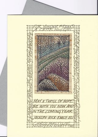
    The completed card featuring excerpts of O Holy Night and a wintery landscape is 6.25"x4.6."


    Line work

    These 3"x1.5" pen and ink drawings became the masters for the linear artwork that was printed with the now hard-to-find Gocco printer. The right hand image was printed in multiple colors, as seen above and below.

    Occasionally, I will come across a long-ago design project of my own that gives me pause. This usually translates to: "Could I have made that project any more complex for myself?" And then this: "Could it really be 20 years ago (or something similarly surprising) that I did that?" Last week when I pulled out a file containing all the workups for my 1992 Christmas card, I had these exact thoughts.

    What many colleagues and clients do not know is that I am a printmaker at heart. Having studied printmaking at the UW for 3 of my 4 years in art school there, I will always be drawn to the medium. Further, I began to be a printmaker when in elementary school. How? With potato prints.

    When designing a multiple-layered piece of artwork, one must consider these factors:

    ~what printing techniques will be used to apply the designs

    ~what paper or papers will be used to carry the image

    ~what order of printing will yield the desired visual effects as the layers build on top of one another


    Gold and color

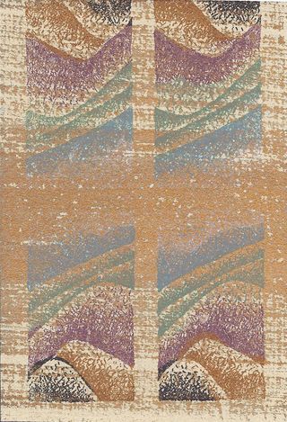
    I chose a handmade, wheat-colored paper over which I loosely brushed gold paint before printing the first background color layer. For practicality, I printed four images at one pass.

    Because printmaking requires significant, technical design forethought, and it involves creating indirect works of art (i.e., the artist does not directly apply the ink to the matrix), it is not the universal favorite means of artmaking for artists. Traditionally, fine printmaking (as opposed to commercial printing) has been considered secondary to the art of painting on
    canvas or wood panels (early Renaissance). Nonetheless, over the centuries, many reknowned artists have created etchings, lithographs, serigraphs (silkscreen) and woodblock prints in addition to their direct painting on canvas or wood.


    Quad linework

    Here, the line drawing is set up to print over the gold paint background and the first multiple color layer, thus rendering the landscape detail over all.


    Making multiple artworks has always given me a lot of satisfaction. I like the technical process of designing for multiples. Christmas cards are the perfect size for trying various printmaking techniques. The Gocco printer is a device that is a cross between a rubber stamp and a silkscreen, giving it unprecedented potential as a small "printing press" primarily for hobbyists but used also by fine artists. It was a sad day when the Japanese manufacturer decided to no longer market it in the U.S. One can still find the supplies, but the costs for these are now prohibitive for previously frequent users like myself.

    After I printed the line drawing layer over the color and the gold-painted paper, I printed the text and border directly onto the cream cardstock. Below you see the guidelines I drew to create a border and a place to carry the
    excerpt from O Holy Night and a personal message from my family. Once these were printed, I cut apart the four-up images and tipped them onto the printed cards. Messages were handwritten on the backs of the cards. Simple as pie, right?!

    Guidelines


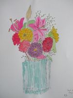
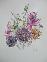
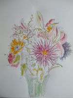
  • Now that autumn is in full, damp presence here in Seattle, I thought this would be a good time to post a Drawing Group project that is a glance back at summer! The three of us met up in Edmonds, WA, where we gathered with coffee, muffins, and our pens and paints around one vase of late summer flowers. Here is what turned out from our congenial sip-nibble-chat-draw session. Click on each bouquet if you want a close-up view.

    DSCF9745
    DSCF9744
    DSCF9748

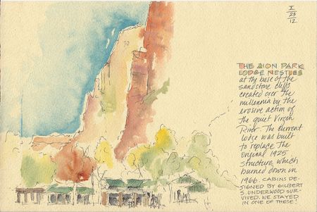
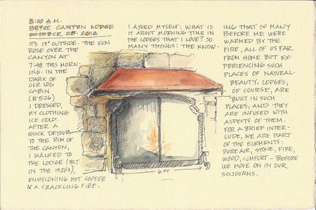
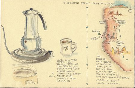
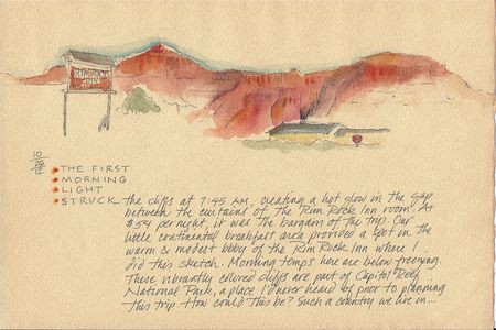
  • Some 40 years ago, I received a postcard from my husband's sister. Her travels had taken her to Zion and Bryce Canyon National Parks, and her awe of these places beamed through her words from that small bit of ephemera. Last week, finally, I went to Utah to visit the canyons with my husband and two friends. Grander and more overwhelming than the imagination can conjure up, the canyons are magnificent. Words barely begin to describe them. These 6"x9" tea-tinted sketches with notes record some of my experiences there. I offer up four of the seven pages I brought home. If you wish, please click on the images to see full-sized files to facilitate reading.

    Zion Lodge

    Beneath towering cliffs rests the rebuilt lodge at Zion National Park.

    Lodge Fireplace

    Morning musings before the fireplace at Bryce Canyon Lodge, located at the brim of the canyon at 8,000 feet.

    Coffee Time

    At the start of each day, Margaret made coffee for us as we discussed the prior day's events, and decided what hikes to take that day.

    RimRock View-1

    This day began as they all did: with majestic stone surroundings and cerulean blue skies. I reinforced my little paintbox with suitable colors before leaving home.

    For my students and other nature journalists: I used Arches Text Wove for all but the fireplace page, which was Rives BFK (an experiment). The paper was immersion-dyed after being cut to size. The pen used was the Signo RT Gel .038, with W&N artist grade paint. I used a Pentel waterbrush which travels well.


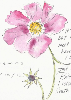
  • Cosmos sketchThe cosmos is not a flower I knew until I was an adult, and when I first saw cosmos it was love at first sight. What a fabulous name for an easy-to-grow species. I never fail to feel moved by their simple beauty.

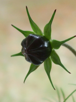
    Two days ago I wrote to a close friend. On the left is a scan of the cosmos I sketched for her on the letter paper. As I sat by the window in my studio, the morning light shone through the blossom as it backlit the dense buds. It was then that I took a good look for the first time at the exquisite, symmetrical bud. I had quickly sketched them before, but had never seen one as I saw it that day. I had to put down my pen and take a photo:

    DSCF9590


  • Of the eleven map designers in The Artful Map, A One-Page Journal, five elected to create maps unrelated to the North Cascades environment. Being in a place where the tools, materials, and design instruction were available to them allowed them to fulfill their concepts of maps that illustrated other meaningful places and heartfelt experience.

    DSCF9314

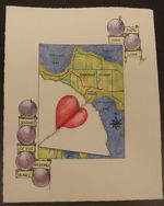
    Patricia Resseguie's map was inspired by a certain heart-related incident.
    DSCF9330

     In these photos, her design takes shape and color becomes an important element. Added to her drawn central images, she designed a partial border of banners, spheres, and significant words.
    DSCF9364

    Please click on this image to see a larger view of her finished map.
    DSCF9326

    As a child and as a young adult, the Girl Scout Camp Robbinswold played an important part in Ardi Butler's life. She brought reference materials (photos and a basic map) to use for her own illustrated map.
    DSCF9341

    Carefully done drawings and map graphics enhance the overall piece and evoke memories.
    DSCF9331

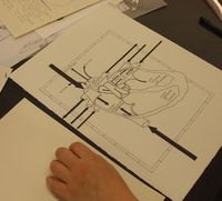
    Sarah Baylinson took an image of a heart and created a metaphorical map. Careful design decisions and precise rendering yielded a clean, crisp image. Click on the image to the right for a close-up view of her heart-as-map.

    DSCF9352

    DSCF9344

    DSCF9312

    Starting with the inspiration to map her own Camano Island home, Mary Ann Weeks used a GoogleEarth image to help get her started. She transferred her elegantly-shaped pencil renderings (above) to final paper. On the left you see her applying one of many layers of colored pencil to her drawing.

    DSCF9345

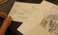
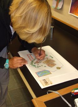
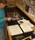
    Above, Shannon Finch diligently works at transferring map, insets, titles, and illustrations to one sheet of paper.
    Shannon map

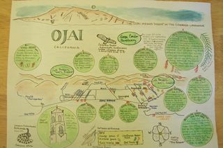
    Memories and iconic images of Ohai, CA, help make up Shannon's comemmoration of her many years of visiting the city where her parents previously lived. Drawing and watercoloring were things she had done little of, so making this complex map challenged her.

    DSCF9322

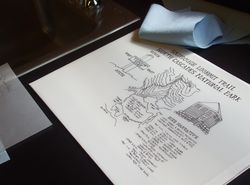
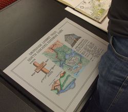
    Here we are (minus Stephanie, Libby, and Jessica) at the trailhead sign for the Happy Creek Trail located 6 miles east of the Learning Center. I designed the map on this newly installed Park sign. This was our lunchtime field trip taken on Saturday, Sept. 8. Judging by the smiles, everyone was ready to leave projects on desks and get out into the forest.

    DSCF9361

    After the end of the Artists' Retreat, each class visits the studios of the others that were also part of the retreat. Here you can see our classroom filled with visitors viewing the finished maps along with the work-ups done by everyone.
    Well done, cartographers!
  • DSCF9303For eleven determined map designers, the ever-available view of the North Cascades' Colonial Peak and Pyramid Peak from the North Cascades Institute's Environmental Learning Center on Diablo Lake may have helped give them perspective as they navigated their ways through the complex process of drawing maps during The Artful Map, A One-Page Nature Journal (Sept. 6-9). This class does not offer templates; each participant designs her or his individual representation of a Place. As we all learned, this requires the courage of a mountain climber and the calm of a monk. They earned their badges, as their work will testify. Some had considerable art experience, and some had very little at all. Each one pushed to learn new technical skills and develop keen eyes for design. I have divided the review into two parts. Part I, here, shows the maps that were based on the local or regional areas in the North Cascades. Scroll down further to read Part II:

    DSCF9351

    Robin and Stephanie both used frosted mylar, ink, and colored pencil. Both maps are 11" x 17."


    DSCF9349

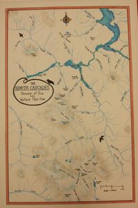
    Robin Downs (her map is on the left) was inspired to render the waters and glaciers of the North Cascades punctuated with black bird icons. Above, Stephanie Bennett chose to feature "The Pickets,", a series of rugged peaks in the N. Cascades. The elevation lines created rich linear texture while carefully drawn peaks showed through in vignette form.


    DSCF9319

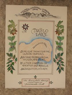
    Jennifer Klamm arrived in class knowing she wanted to work with colored pencils. Other than that, she had no pre-conceived idea. The result: a richly illustrated map with her own poetic words featuring the beautiful little Peninsula Trail at the edge of Diablo Lake. Her studious and methodical way of working can be seen above.

    DSCF9342 


    DSCF9334

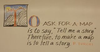
    My dry-erase marker set comes in handy in my workshops at the Learning
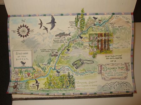
    Center. To offer a little daily lettering design lesson, I will select a quote to put up on the board. The maps made in the class told many stories. Below, Libby Mills incorporated as many possible visual stories related to this region as she could fit on one small journal page. Click on her map to see a larger view, and have fun reading this map.


    DSCF9354

    Libby Mills' one-page "favorite distractions and highights" featuring sightings of Dippers along the SR 20 route to the Learning Center.

    DSCF9329

    Brain Peterman composed his page with three columns and a very nicely lettered title stretching across the top. Illustrations and detailed journal notes complemented the central map showing the hiking route he and his wife followed the week before the class.
    DSCF9366

    The completed, artful map. Recently retired from a career in computer-related work, Brian enjoyed making something entirely by hand.


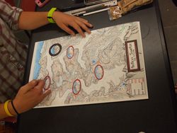
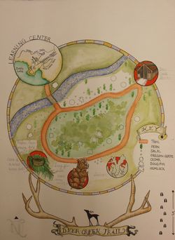
    DSCF9350Jessica Haag's map (not complete yet) features a stylized Deer Creek Trail, an enchanting path near campus, with some favorite highlights. A shelter, a hummingbird's nest, native plants, and various icons enhance her circular map. One of Jessica's intents was to incorporate classic map elements in unconventional ways. Her scale is represented in hoof prints.

    Part II may be seen below.