Jocelyn Curry

Art & Joie de Vivre

  • Naples Bot
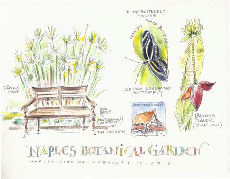
    What could provide better material for a nature journal page than a botanical garden? I created this page on my recent trip to Florida. I have already used it as a teaching sampler for a short class I taught in March because it incorporates elements that contribute to a designed page as opposed to a random page of entries. Both approaches are fine when it comes to journaling.

    This page includes: a title, a divided layout with one half being a larger sketch, and the other being a group of smaller sketches, a combination of plants, animal, and structures, and a variety of scales. The drawings and the lettering were all done with the same two items: black ink and watercolor. This assures a textural and color harmony throughout the page.

    If you would like to study nature journaling with me and a small group of enthusiastic nature-lovers, please consider coming to the small community of Bay View, Washington, for a July 13 & 14 nature journaling workshop. There are 3 spots left. Please click here for more information.

  • Wedding journal page sm
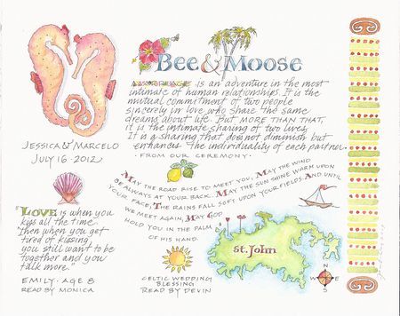
    One of my recent commissions was a wedding memento artwork for the niece of my client. After being provided with plenty of information about the ceremony held on St. John in the U.S. Virgin Islands, I filled an 8"x10" page with handwritten texts and illustrations. This piece will be framed. Followers of my work will recognize the pair of seahorses, designed for my own niece's wedding. Paired seahorses were also a motif in this young woman's wedding. I used a tech drawing pen with India ink, and watercolor on 140 lb. cold press watercolor paper.

  • While searching through file folders last week, my eye landed on one that is 20 years old. I pulled it out and opened it. As always, seeing work I did long ago stirs up various emotions. In this case, I time-traveled to the days before we all had the Adobe Creative Suite on our computers; it was a time for most graphic artists (but not all) to use French curves, technical pens, and white-out to create crisp logos by hand. I looked at the original artwork for the logo below, and had to admire how steady my hand was, back in 1993! Also, I was pleased to realize that I still like my design. This logo was done for a designer/carpenter whose business name was Creative Interiors. Nowadays, this design would not be difficult to create in Illustrator, a design program utilizing vectors.

    CI

  • A week ago I taught a one-day workshop, Introduction to Nature Journaling for Calligraphers. Sponsored by the Olympia, WA "Nib N'Inks" calligraphy guild, the goal for the day was to focus on seeing, sketching, labeling, and designing nature journal pages. The eleven students were exceptionally focused, producing both warm-up studies in ink, and finished ink and watercolor images on art grade paper. The day went by quickly, allowing little time to photograph, but here are some of the colorful specimen pages, followed by the landscape pages done en plein air (outside).

    DSCF0350 DSCF0351 DSCF0354


    The assignment behind these ink and watercolor images was to draw both items, starting first with pen for the daffodil, then add paint from light to darker values. For the radish, I demonstrated how to loosely paint the color, then lightly add pen lines to generally define the forms.

    DSCF0352 DSCF0355


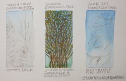
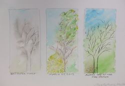
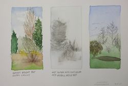
    These four pages above and below ( each 6"x10") particularly illustrate the individual way of seeing that we each experience. Going from drawing a daffodil and a radish to a complex arrangement of deciduous trees and conifers, outside, is a huge leap.

    DSCF0356 DSCF0353 


    The students launched into this with no mention of intimidation. Beginning with rectangles in pencil, they began this exercise by laying down a watercolor wash in one of the rectangles. That dried prior to our outdoor sketching session. Back in the classroom, they drew wet-into-wet, from memory, in another of the rectangles. I love the variety of feeling each little tree portrait carries in this series. Nice work, participants!

    (I'm sorry not to be able to label each piece with the artist's name. I know who did a few of these, but not all of them.)


  • About 22 years ago I created a series of six tiny (3"x5" or so) artworks called Small Events. They were mixed media works on paper using graphite and watercolor. They illustrated minor incidents that struck me as poignant. Today I decided to feature two "small events" that have occurred in this first week of spring–but to save time I'm offering them in the form of photos, not artworks. Here they are:

    Daffodil

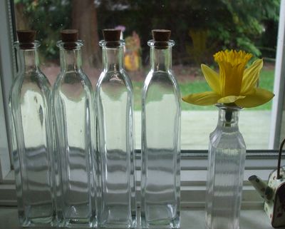
    #1~ Returning home from the grocery store, I reached into my bag to pull out my two bouquets of tightly budded daffodils. One bud had broken off and lay at the bottom of the bag. Sad, I reached for the compost container to toss in the bud, but then thought, "if I stick this in water, would it still open?" I did this, and you can see the result! The slim, tight bud had the DNA required to keep on blooming.
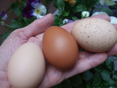
    Three eggs

    #2~ All three hens are laying! And, today, all three laid! It's rare that they all lay on the same day, especially since they are no longer spring chickens, so to speak. They are going on two years old. But they have sprightly ways and plenty of spunk. Thank you, girls.


  • When a prominent company comes seeking one's work, any freelance artist's heart beats a little faster. Such was the case when I was contacted by the design firm working on a new Starbucks product.

    When I recently saw a display of Iced Coffee by Seattle's reknowned coffee giant, I reflected back to 1996 when I received the call and subsequently did the lettering for a new product: a bottled, carbonated, spiced and sweetened coffee. Sound a little odd? Well, it evidently was too odd, because the California test market for Mazagran ended with the scrapping of this bottled beverage. It never made it to most grocery store shelves. Indeed, I got my bottle from someone who ended up having a case of it in his garage! Read about Mazagran in this blog. The story is well-told by this coffee-loving blogger. He didn't say who did the lettering (maybe I should write to him), but the story does jive with what I was told at the time.

    Shortly after the failure of Mazagran, Starbucks invented the Frappuccino™, which is still with us today. Again, hand lettering was used for the identity of this product. Incorporating personality into a name is the specialty of lettering artists, so we were frequently sought out by design teams in the 1990's. It's always a fun exploration to try expressive letters and words with pen and brush and submit them in hopes of capturing the spirit of the product.

    Contemporary typography has shifted to a cleaner, more neutral style. A case in point: Iced Coffee. There's no story here, as with Mazagran. It's the straight-up beverage, something to chill and open up on a hot summer day. I'll save my bottle of iced coffee, not for the graphic design, but for the day when cold coffee actually sounds good.

    DSCF0310

    My mid-90's lettering of "Mazagran" contrasts the contemporary presentation of "Iced Coffee." Click on the photo to see the lettering up close.


    Frappuccino

    "frappuccino™" was also issued in the mid-90's, but it succeeded.


  • Cup 3When I was 20, I took a quarter off from my studies at the University of Washington to study the Mexican arts and crafts in San Miguel de Allende. While there, I invited a friend to come visit. Her reply? To chastise me for flaunting my privileged life of travel. This remark came as a shock, as I was born into not a family of wealth but into one where investing in travel was paramount. To this day, I am frugal in most areas of my life, choosing to reserve income for two things: supporting my family and traveling. However it may appear from the outside, to me, traveling is as essential to my being as food is to my body.

    So it was particularly fabulous (I'm trying to think of a better word) when both a long-time friend and a cousin invited me to come visit them at their snowbird homes in Florida, a place I had never been to and a place that distinctly contrasts where I live in Washington state. A long, diagonal flight has taken me to the SW coast of Florida for the past three Februaries now, thanks to their repeat invitations. To explore a new place with people I love, but rarely get to spend time with, is a keenly treasured experience for me. Of course it doesn't hurt that in February, escaping the gray damp of Seattle is an opportunity I would be crazy to decline.

    I would have to confess to my friend from long ago that I think I now know what it feels like to be privileged. My current friend and my cousin have literally and graciously given me these travel experiences. Yesterday, while driving alone on roads through quintessentially Pacific Northwest scenic byways, I pondered all of this, and felt filled with gratitude.

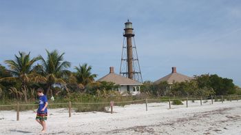
    DSCF0177

    Last week, I was here on the Lighthouse Beach on Sanibel Island, Florida (click on photos for a full view).
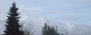
    DSCF0251

    Yesterday, I photographed this breathtaking view from a parking lot in Darrington, Washington. I was on my way to a site visit for a new map design job, and was struck by the contrast between where I dwelled last week, and where I live most of the year.


  •  

    Wowl

    Barred Owl

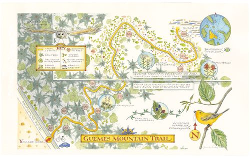
    It's been several months since I completed a map for one of the Skagit Land Trust's preservation areas. Today, the signage that incorporates my artwork is being installed up at the trailhead of a recently completed nature walk trail up Guemes Mountain on Guemes Island. This is why I can now reveal the artwork for the map!

    When I was contacted and asked to design a map for this beautiful parcel of land, I had never been on this island off the shore of Anacortes, Washington. It is one of the islands in the San Juan archipelago, and consists of primarily privately held land. There is one store, one State Park, and a lot of beautiful open land.

    Map sketch

    Pencil sketch as submitted to the Skagit Land Trust

    The trail in question traverses old, mixed forest as well as young forest and meadowland. All along the trail, one has the opportunity to see a broad range of native flora and fauna which vary throughout the year. At the summit of Guemes Mountain where the trail ends and the view of the San Juans and the mainland stretch widely out before you, there are rock outcroppings interspersed with wildflower patches. My map depicts the trail, the basic habitat areas, some of the flora and fauna, and some information about elevation changes.

    XGuemes Mountain Map Final sm copy

    Completed map, dimensions: 10.5"x17", graphite, pen & ink, and watercolor

    The artwork was scanned professionally as a TIFF file. After receiving the scan, I did some fairly involved revisions, which, thanks to the power of PhotoShop, yielded an accurately informative and colorful map.

    Are you interested in walking the trail and seeing the view from the top of Guemes Mountain? It's a gentle ascent. A small ferry carries one from Anacortes to the island. Either take your car for the 2.5 mile drive to the trailhead, or walk on and pick up a bicycle from the Anderson Store near the ferry dock on the island and pedal your way past dramatic bluffs and tranquil farmlands to the start of the 2.3 mile roundtrip walk.

  • Cup 4
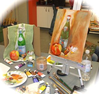
    In most community art classes, one can expect a fairly broad age range among the attendees. Last Sunday, in my day-long oil painting workshop with Ursula Stocke at the excellent Schack Art Center in Everett, my classmates ranged in age from about 18 to 70. My table mate and I didn't chat much, as we were busy trying to make it over our respective painting hurdles. But during the lunch break, we had a brief conversation.

    I learned that she was a recently retired medical doctor. In college, she wanted to study art. But she needed to think about being able to earn a living, so she decided to become a doctor. As she approached retirement age and the end of practicing medicine, she correctly anticipated the need to care for her father. She cut down her practice so she and her husband could spend an intensive 18 months caring for him until his recent death. During this period, she and her husband left town only one time. Now fully retired, after nearly 40 years of life dedicated to practicing medicine and caring for others, she is now turning to her first, original love: art.

    As our classmates gradually returned to the classroom, my table mate said one last thing: "In caring for my father, I saw my own mortality." She said this not with a smile, but with a sober, knowing look into my eyes as she put her last bite of lunch into her mouth. I knew what she was saying: that this painting class was not just a painting class, but part of a renewed beginning for her. At long last, she has freely chosen to do artwork as a way of relating to and enjoying life.

    Our mortality. In the flurry and speed of contemporary life, let us not lose sight of it. It's not too late to take that class, visit that city, pursue what your most elemental self has cried out for but has not yet been given, for whatever reason. This is not selfish. It is for the overall good, and it's important.


    Painting

    My still life study from Sunday's class.


  • When our little group met up for the first time in January, we talked about what we might focus on in 2013. Not that our "focus" is all that rigid. After all, there's the coffee-and-pastry period that precedes the drawing. First things first, right?

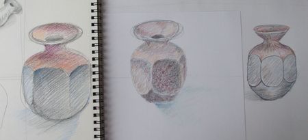
    But back to drawing. The consensus was that we would work on loosening up, becoming more confident and faster at the same time. So yesterday, I led the group through some drawing exercises with that goal in mind. Here are the second and third sets of sketches we did:


    Pots

    A raku-fired pot in terra cotta and black offered challenges in achieving accurate perspective & form, too. We sketched in graphite and then applied colored pencil. The emphasis in adding color was to be painterly in the use. I.e., terra cotta clay is more than one color, really, so we layered color and tried not to stay in the box. My sketch is on the left.

    Galoeplant
    DSCF0101
    Jaloeplant


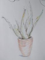
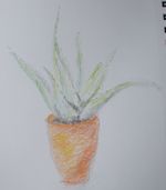
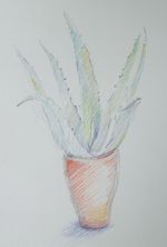
    As a last subject, I offered an aloe plant in an orange pot. With five minutes left in our session, we had no choice but to work quickly and confidently to get the basic shapes indicated on our paper. By this time we were warmed up after our first two subjects. We ended up going overtime, finishing our sketches with focus in 18 minutes. (Mine is on the right.) When students ask me how to achieve a spontaneous look to their sketches, I usually tell them that it has to do with speed & lack of time to overthink it. With the aloe plants, I talked us through a sequence of drawing moves. The result: some nicely impressionistic aloe vera plants!