Jocelyn Curry

Art & Joie de Vivre

Illustrating for Embossing Dies

November 23, 2025

Did I need a deep plunge into a new blog site, right when such a time-consuming challenge really didn’t fit into my crowded calendar? The answer, no surprise, is “no” but at least I was able to navigate the mind-befuddling process of transferring the data from my old platform to this new, AI-enhanced version of good ol’ WordPress. My previous experience of working on good ol’ WordPress wasn’t stellar, so I’m hoping to improve my relationship with it asap. So far I have been able to upload my seasonally appropriate squash painting! But now, HOW do I get rid of “Hello World!” which was placed there by Good Ol. I’m not sure about this, but I think Good Ol’s default tips will stay on this, my First Post until I figure out how to discretely remove them without being told “This is not a good idea.” At least I got my squash up on this new site for your viewing pleasure! Happy Thanksgiving :-).

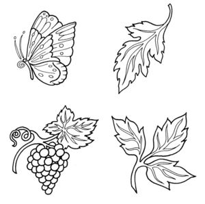
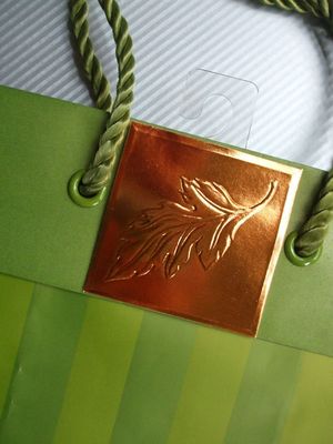
As an illustrator, I have learned a lot about commercial printing and production. To show how a simple illustration serves as a pattern for a fancy die, here are four images I created for embossed die imprints for gift bags. The brush-rendered butterflies were options given for a style choice. Ultimately, a simple line-drawn style was chosen. Here are the four final ink drawings that I completed, plus a photo of one of the final gift bag embellishments for which they were used. The company: Marcel Schurman, now Papyrus. These illustrations are also now available for licensing. Email me for this information.

DieQuartet

A heavier inkline indicates the deepest, primary outline of the die. The finer inkline indicates the shallower level of the design. Note on the photograph below how the single leaf motif translated to the two-level die that was created to emboss the copper.
Bagpic
 

Posted in